
1/5
Category
5 Projects
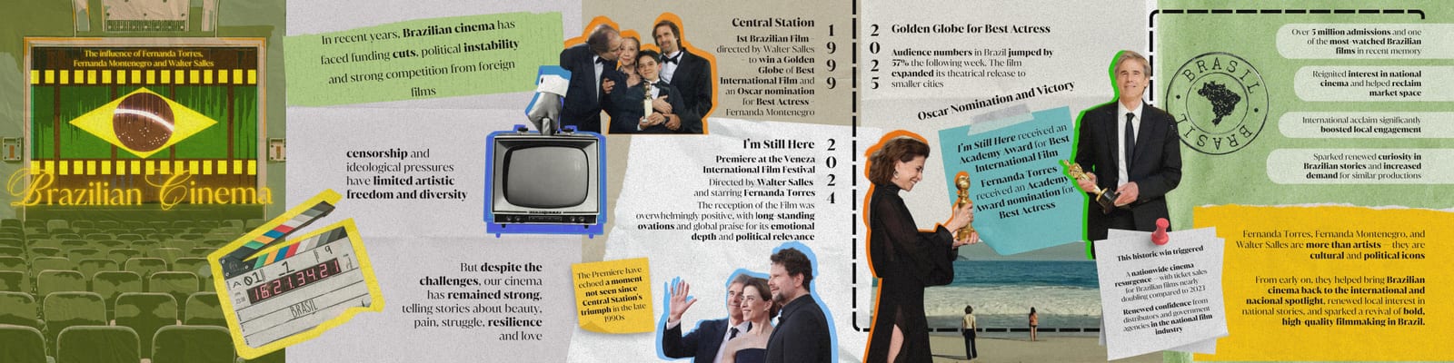
Who are our heroes when algorithms decide who gets seen? A tribute to the revival of Brazilian cinema, told across a magazine spread, an Instagram carousel and a poster.
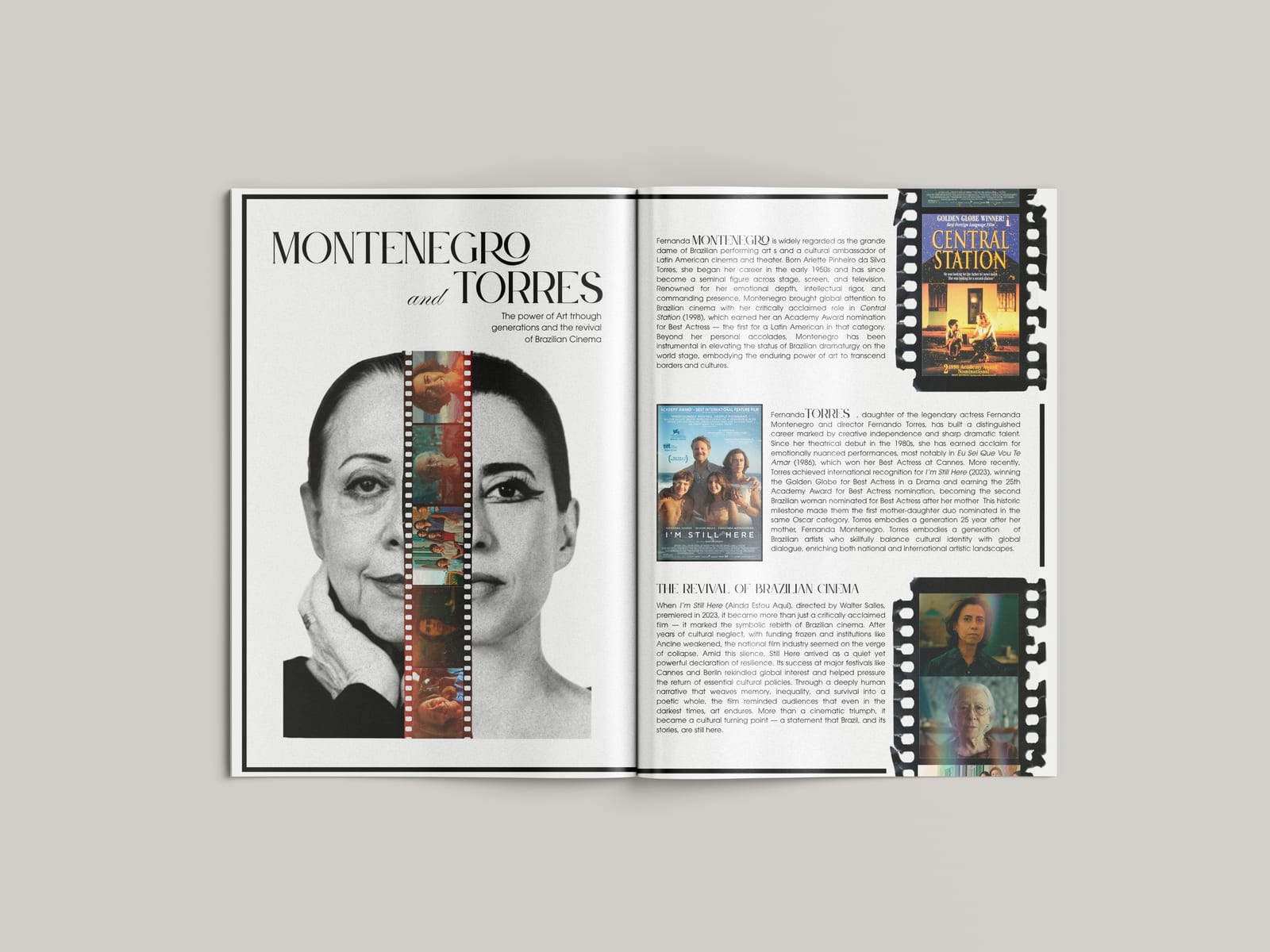
The admission exam asked for three works on the theme "Heroes of Our Time", each in a different medium. On social media, anyone can become a hero overnight, while teachers, scientists and artists lose visibility. I looked for heroes defined by something else: in 2025, I'm Still Here, directed by Walter Salles and starring Fernanda Torres, won a Golden Globe and an Oscar, after years of budget cuts and censorship in Brazil's cultural sector. Brazilians followed every award with the passion usually saved for the World Cup. The project tells this story through two generations, Fernanda Montenegro and her daughter Fernanda Torres, and argues that true heroes aren't made by algorithms, but by their power to reflect a nation's soul.
I built one visual language from collage, film-strip motifs, typography and image editing, then shaped it to the rules of each medium:
01 / 05
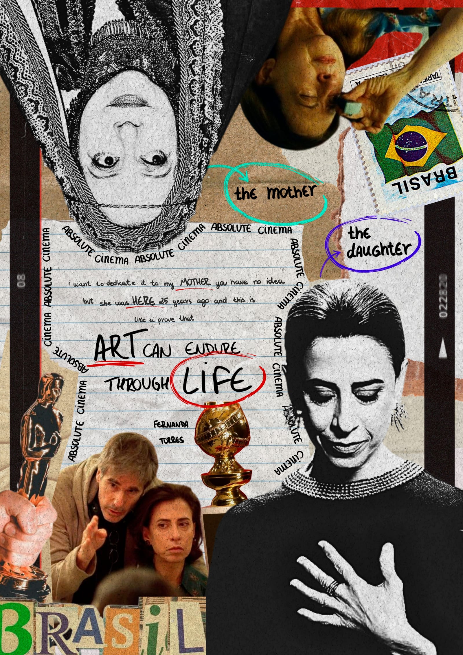
This work was part of the admission exam that earned me a place in the Graphic Design and Photography programme.
A series of posters and printed programmes for chamber music concerts, where each concert gets its own visual identity.
The client is a violist who performs chamber music in changing line-ups, sometimes as a duo with piano, sometimes as a trio with piano and cello. Each concert is different, so instead of one fixed template, every concert gets its own visual concept. I usually start from one of three directions: the repertoire, the instruments being played, or the place and moment of the concert. For a winter concert, the season set the tone; for another, the instrument itself did.
Every concert follows this process, starting from one of these directions. The summer trio concerts are one example: here, the starting point was the place. Both concerts took place in the Alps, in St. Johann im Pongau and in Böckstein, Bad Gastein, surrounded by mountains. So I built a collage of mountain photographs, torn paper, grids and print textures. The design comes in two colourways, deep blue for the first concert and orange for the second, so each date has its own poster while the two clearly belong together. The names of the composers run along the edges like a frame. From the poster, I then developed the programme in the same visual language, so poster and programme form one identity for each concert.
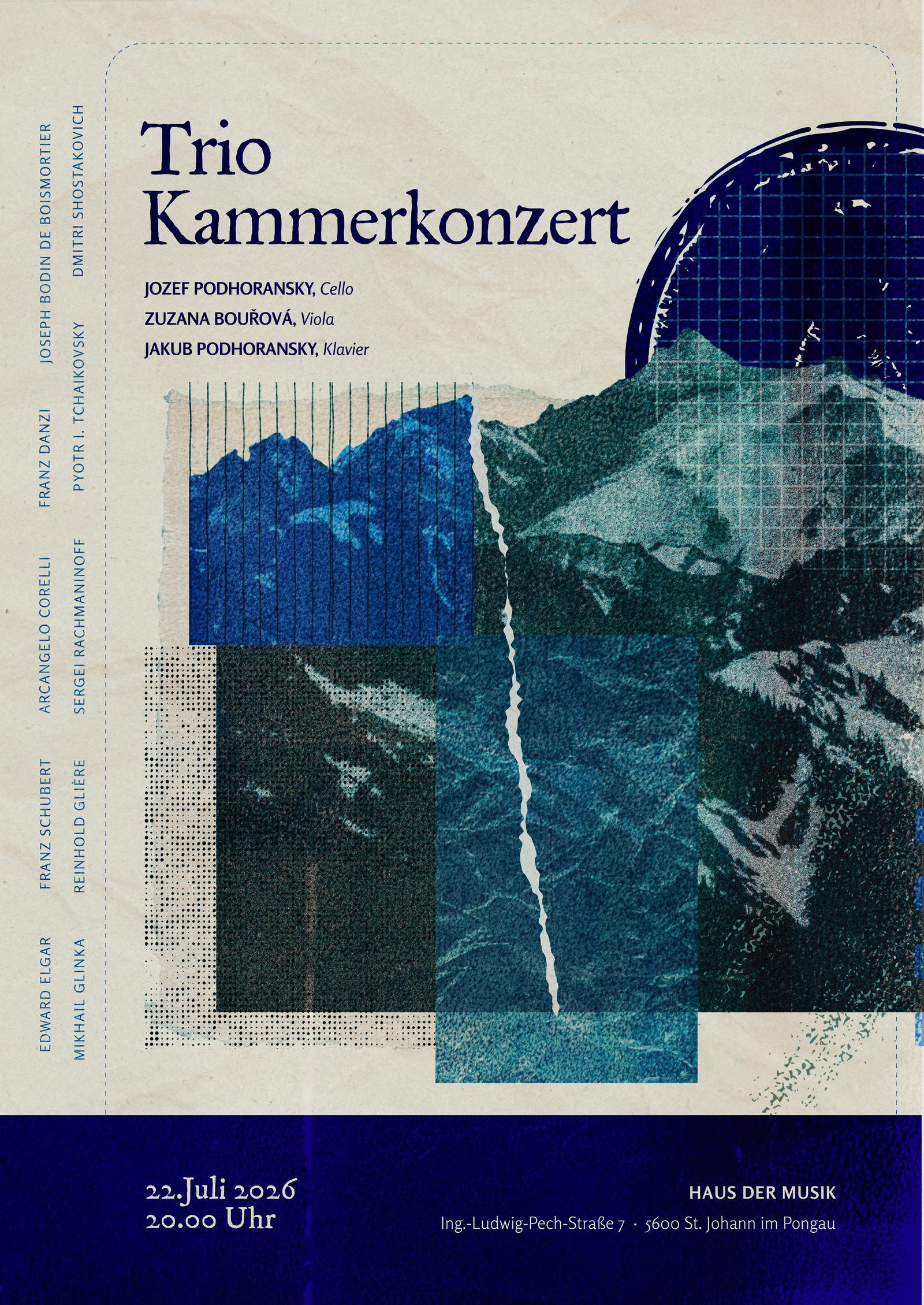
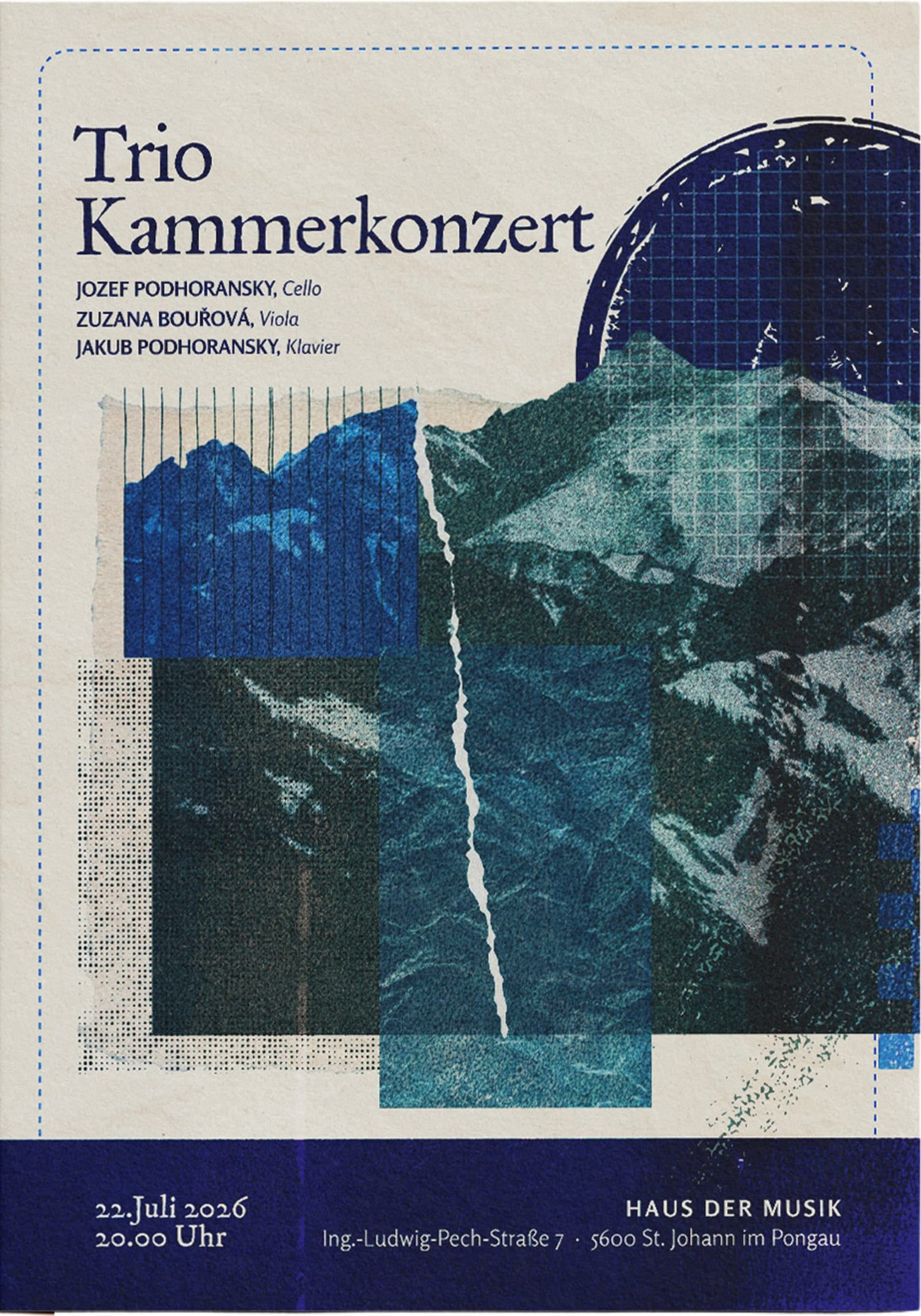
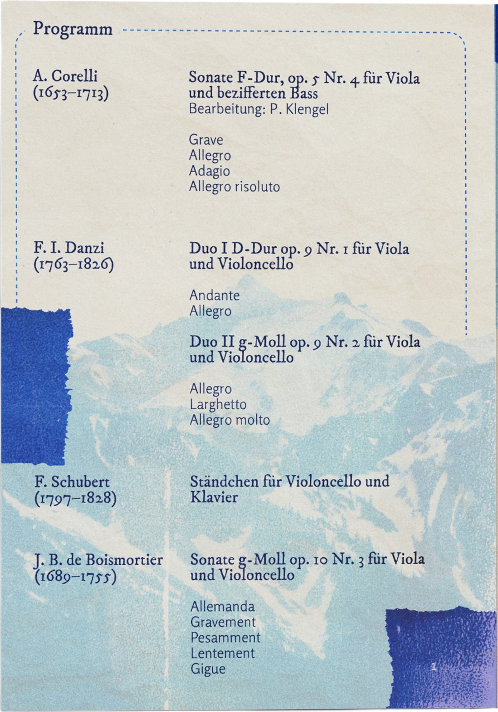
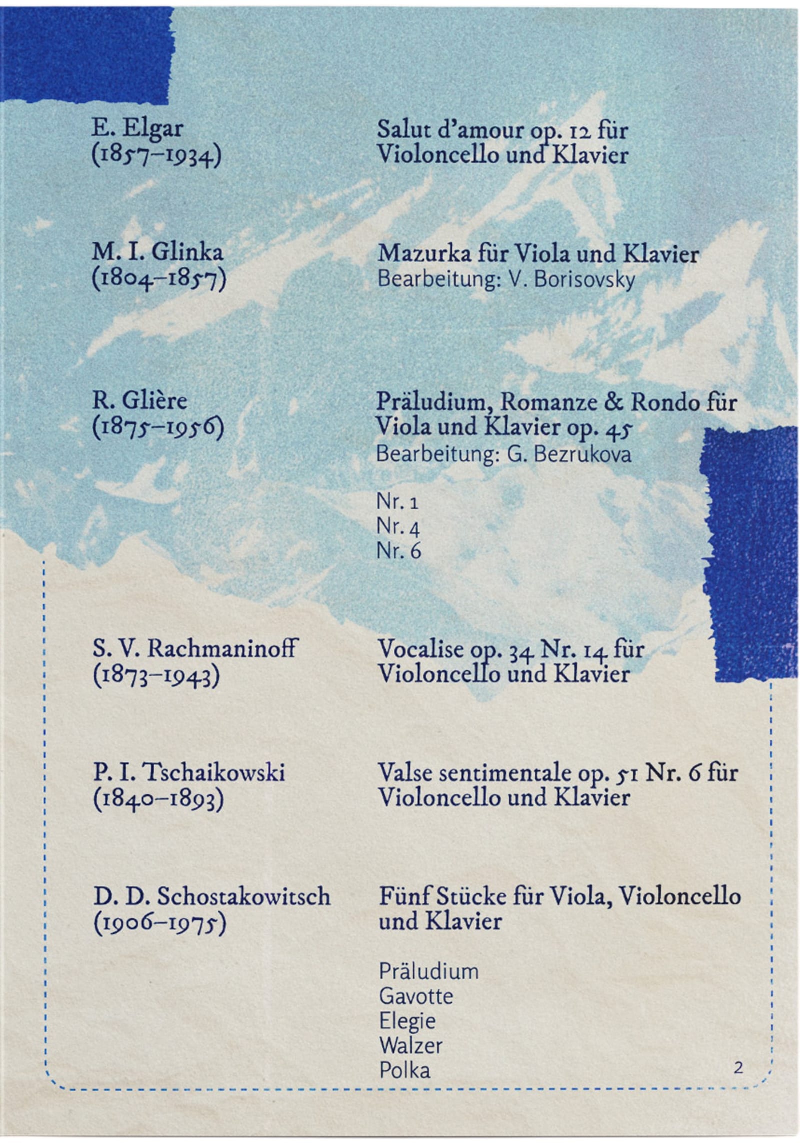
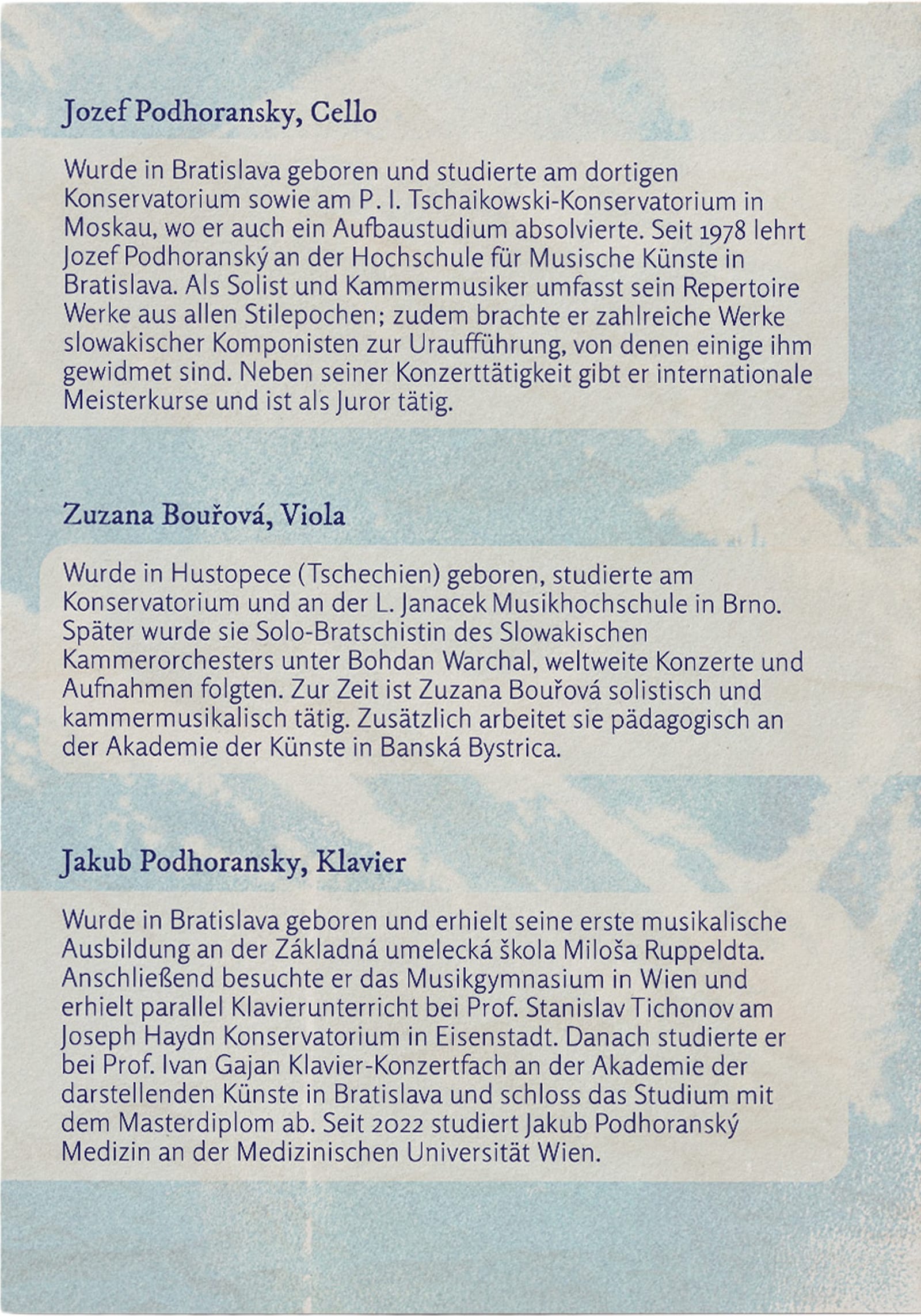
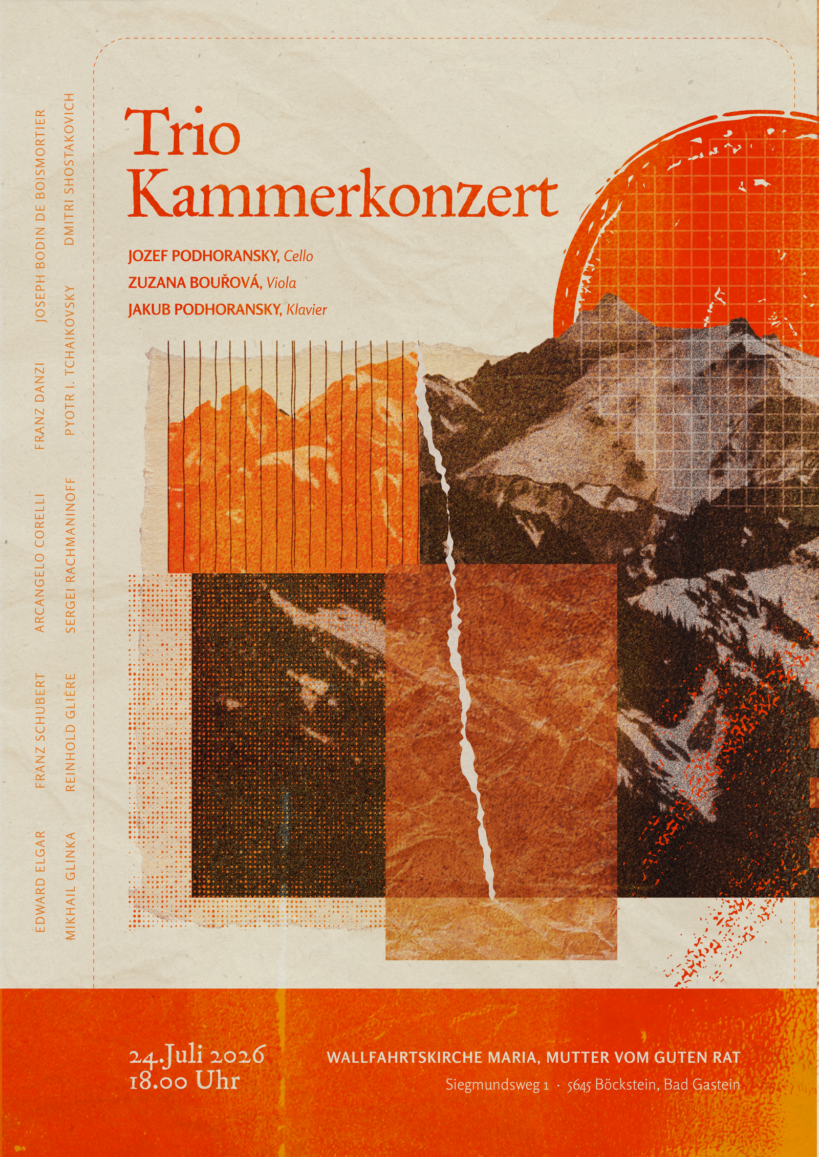
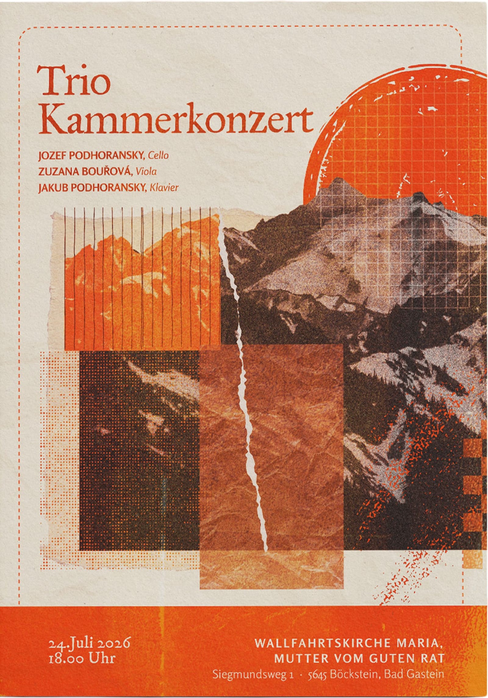
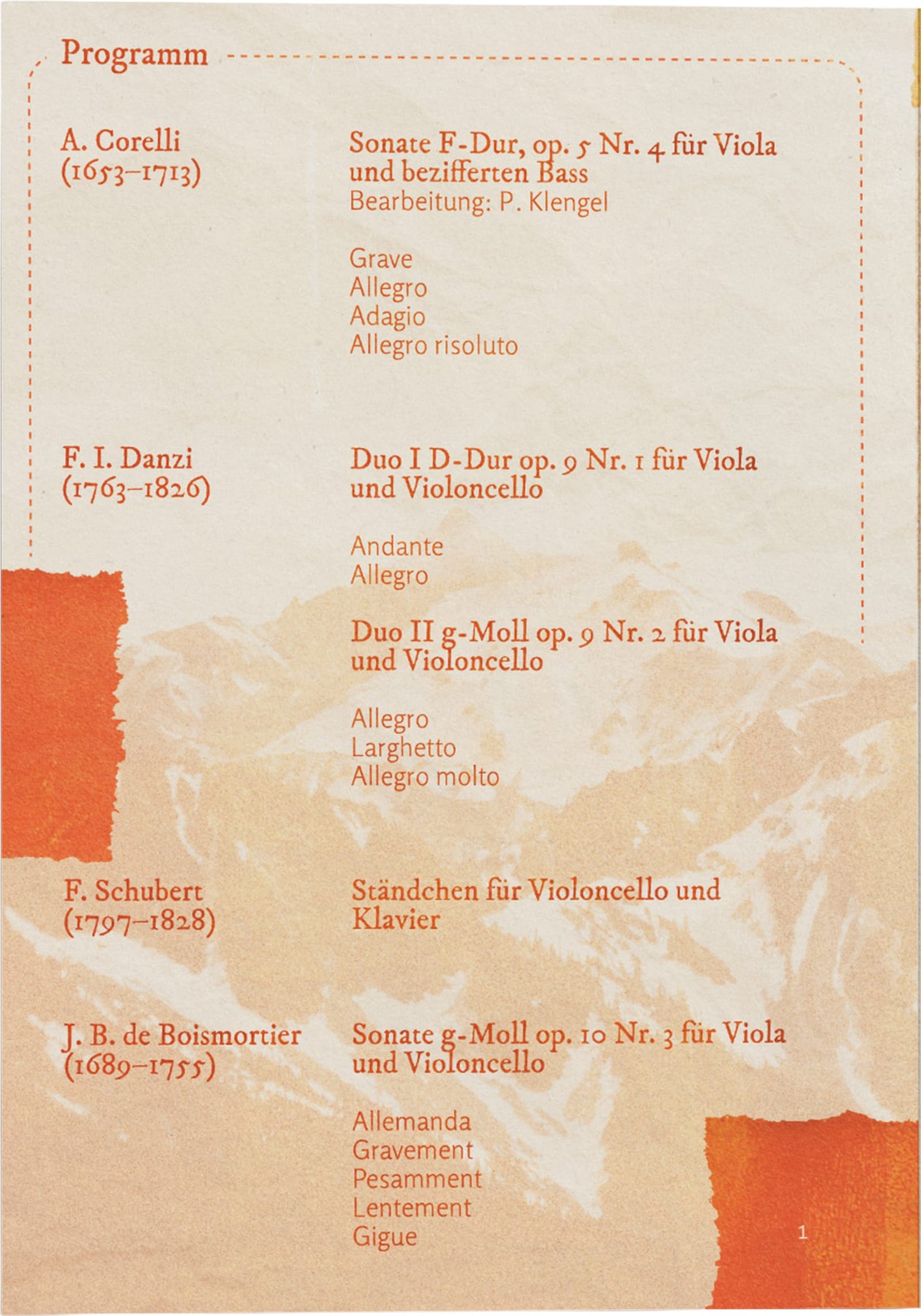
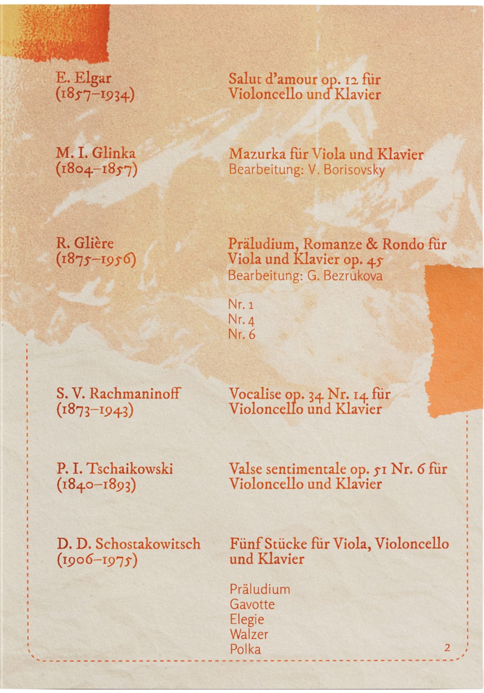
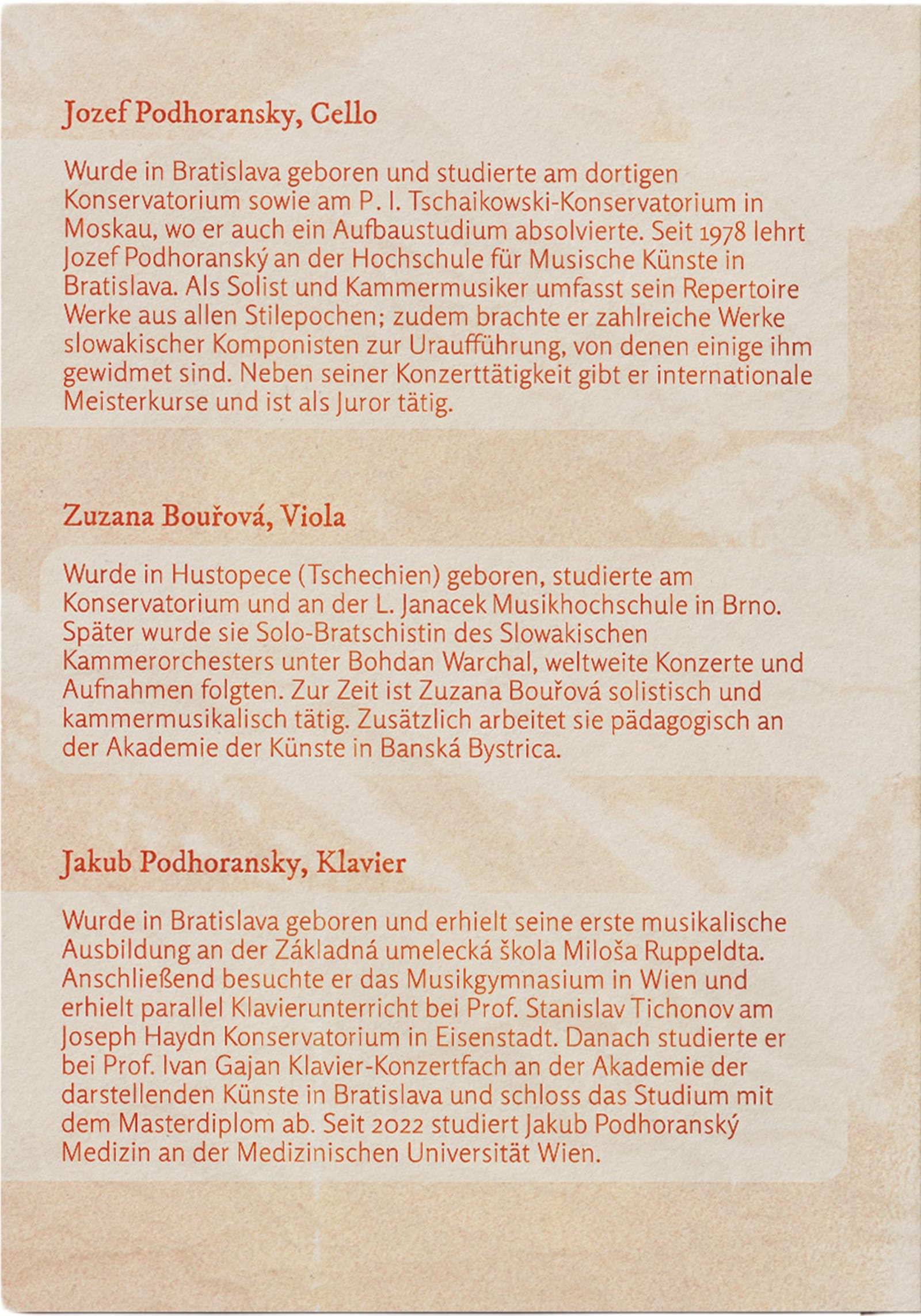
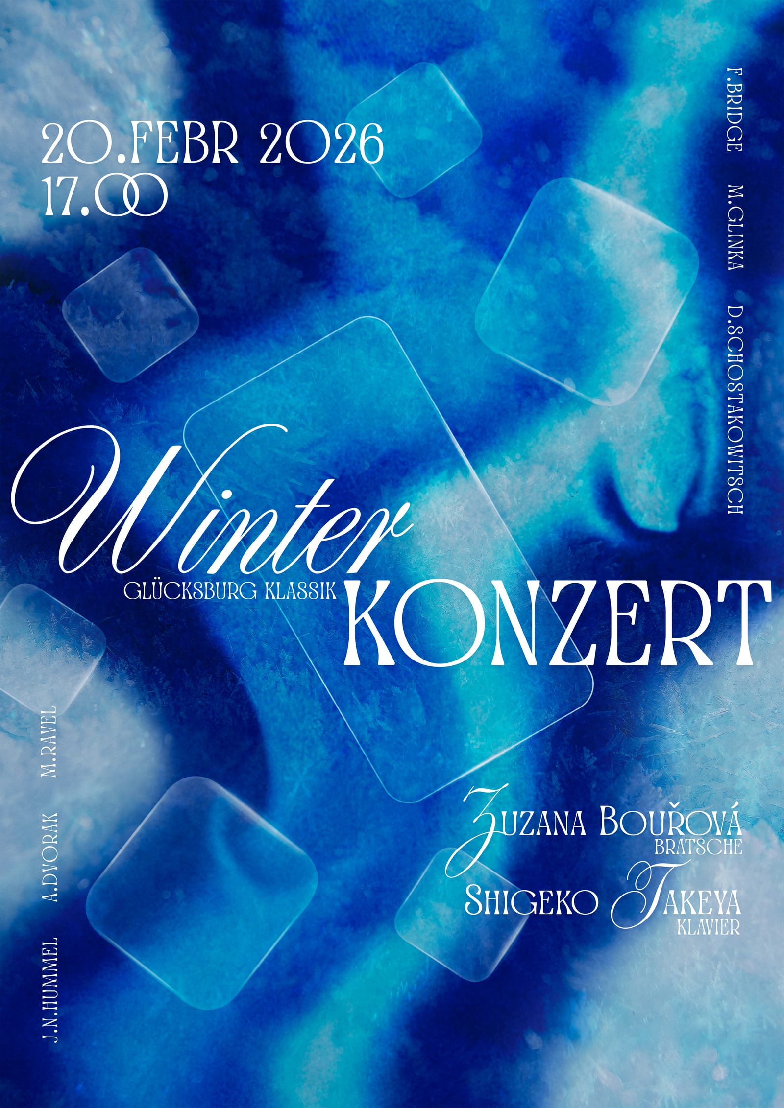
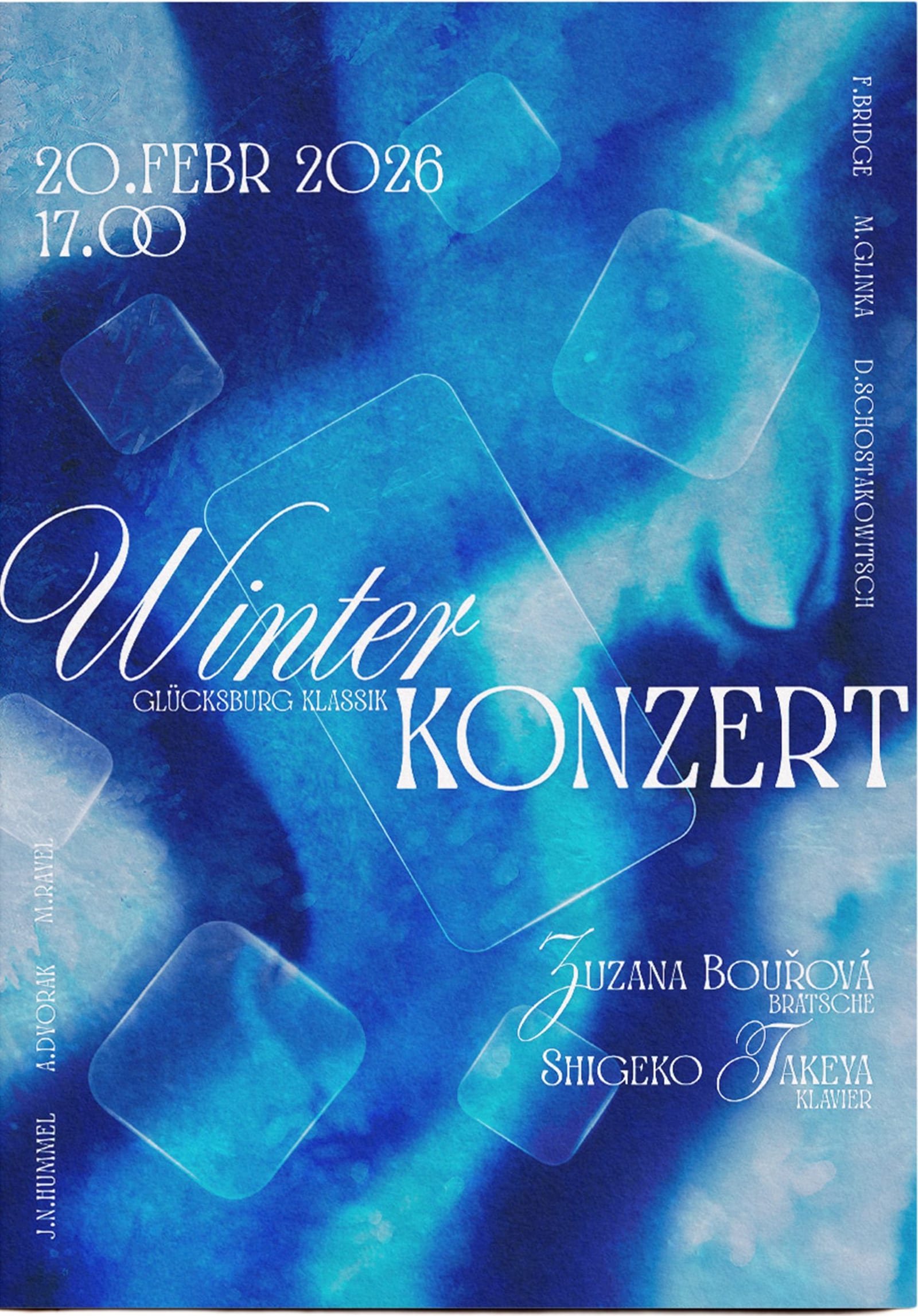
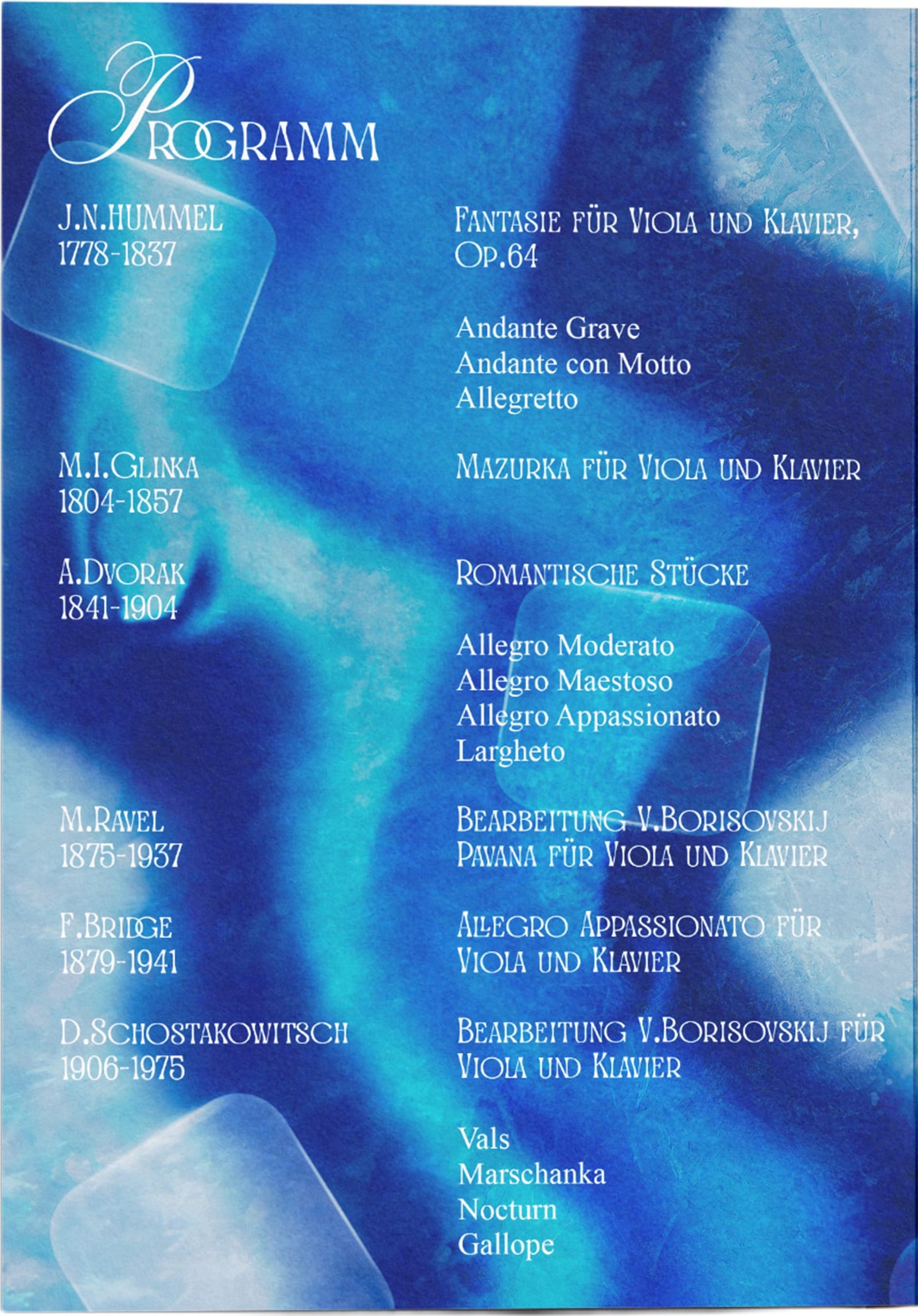
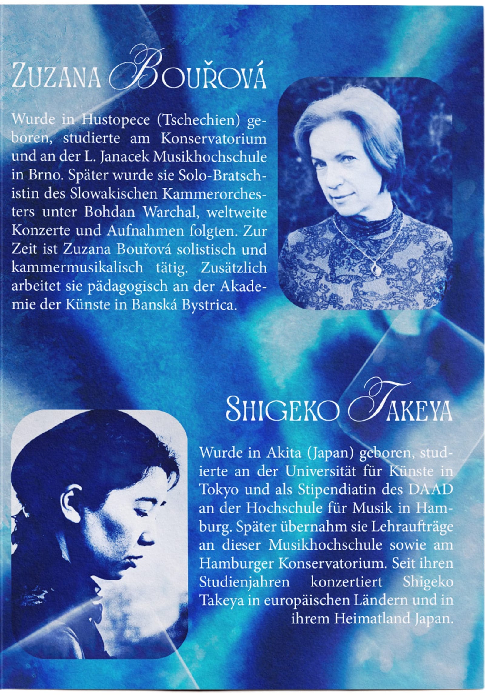
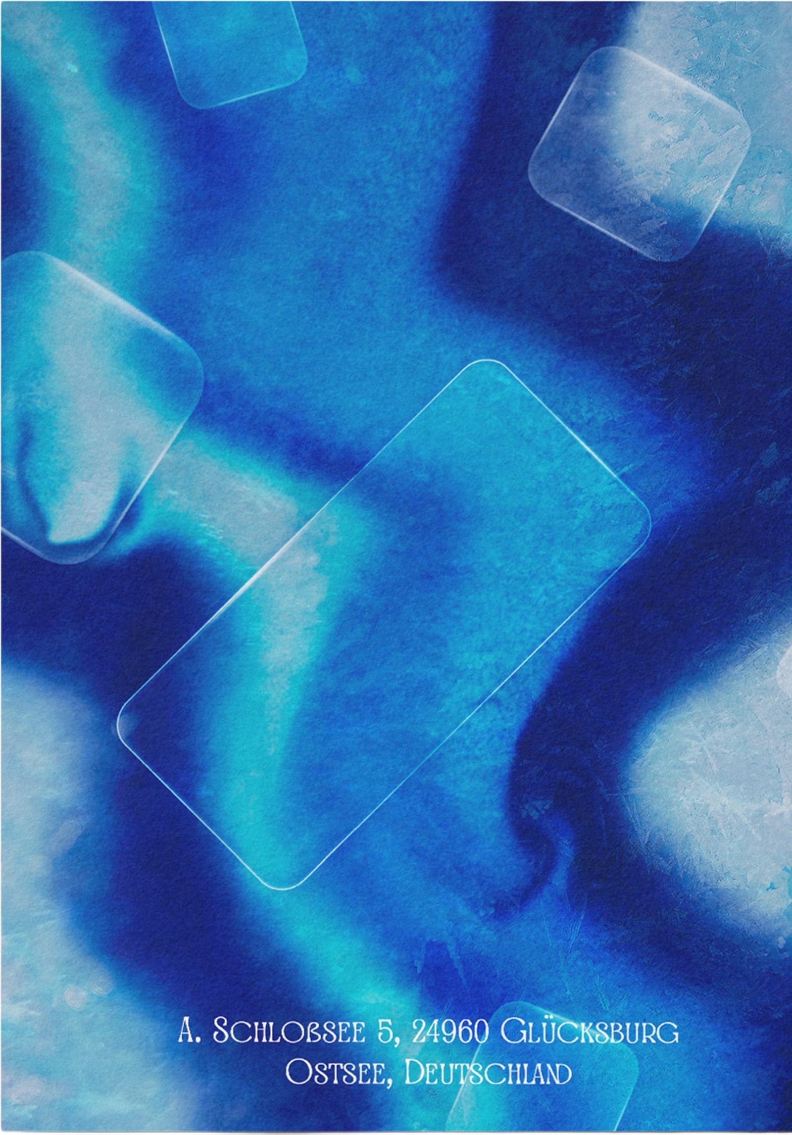
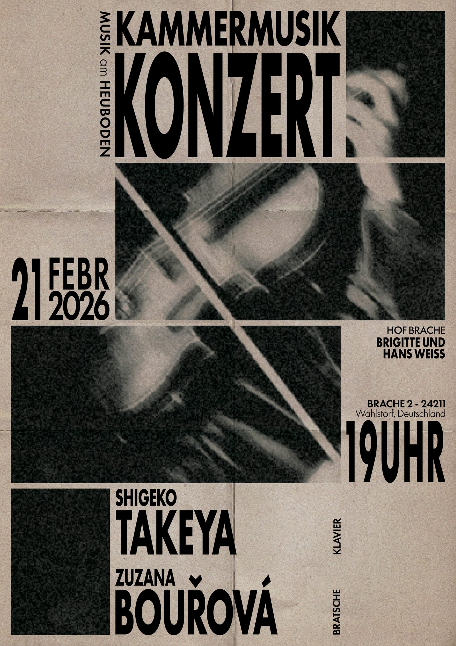
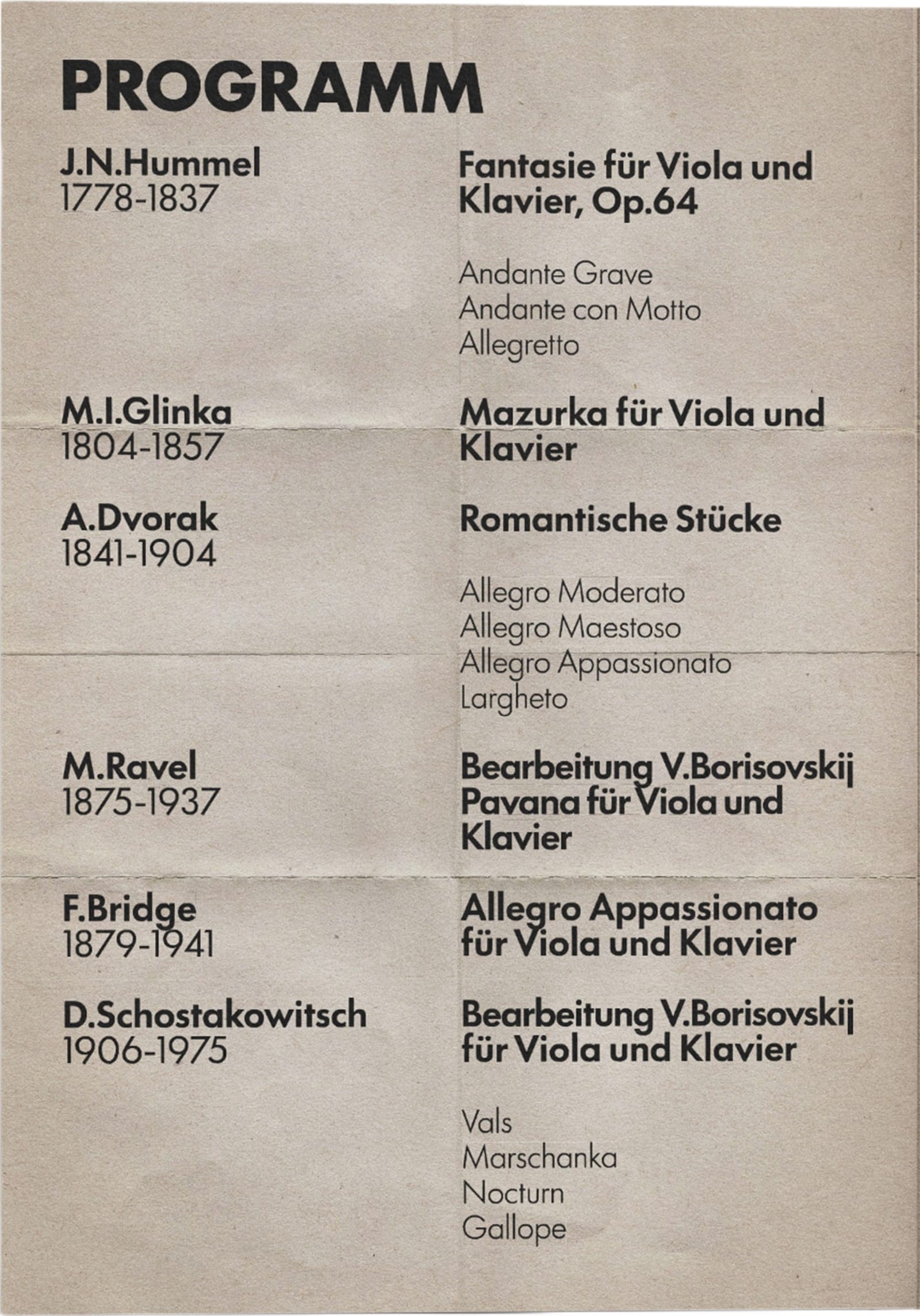
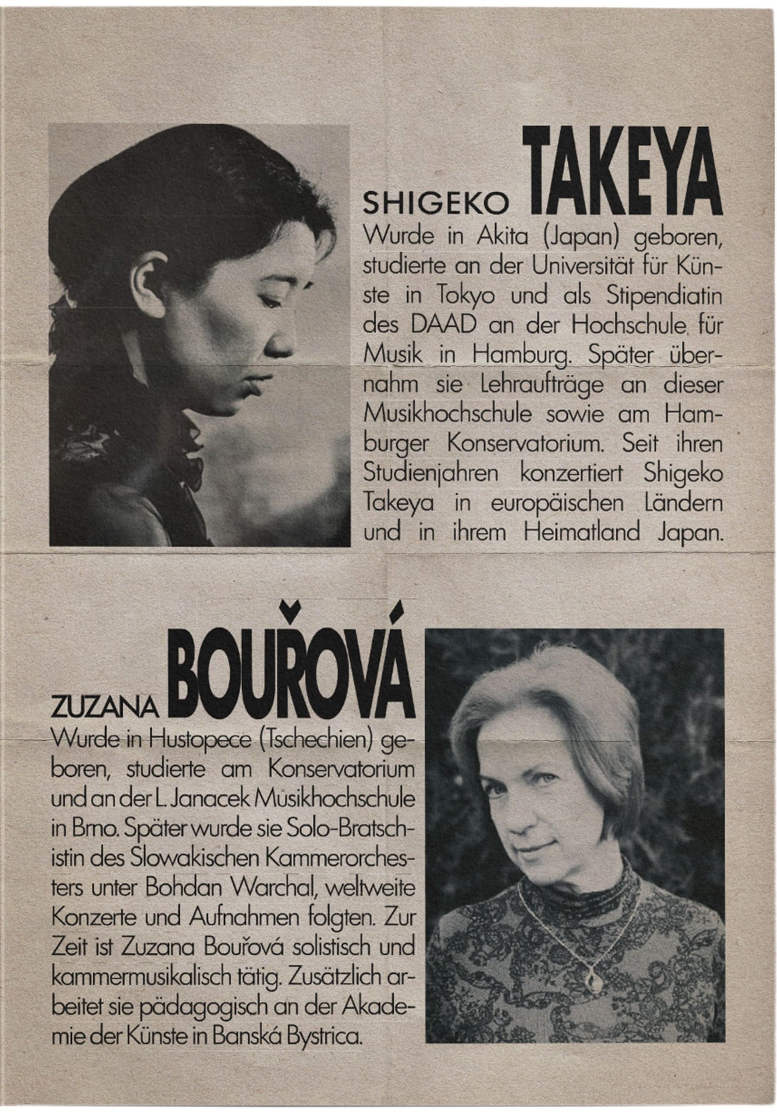
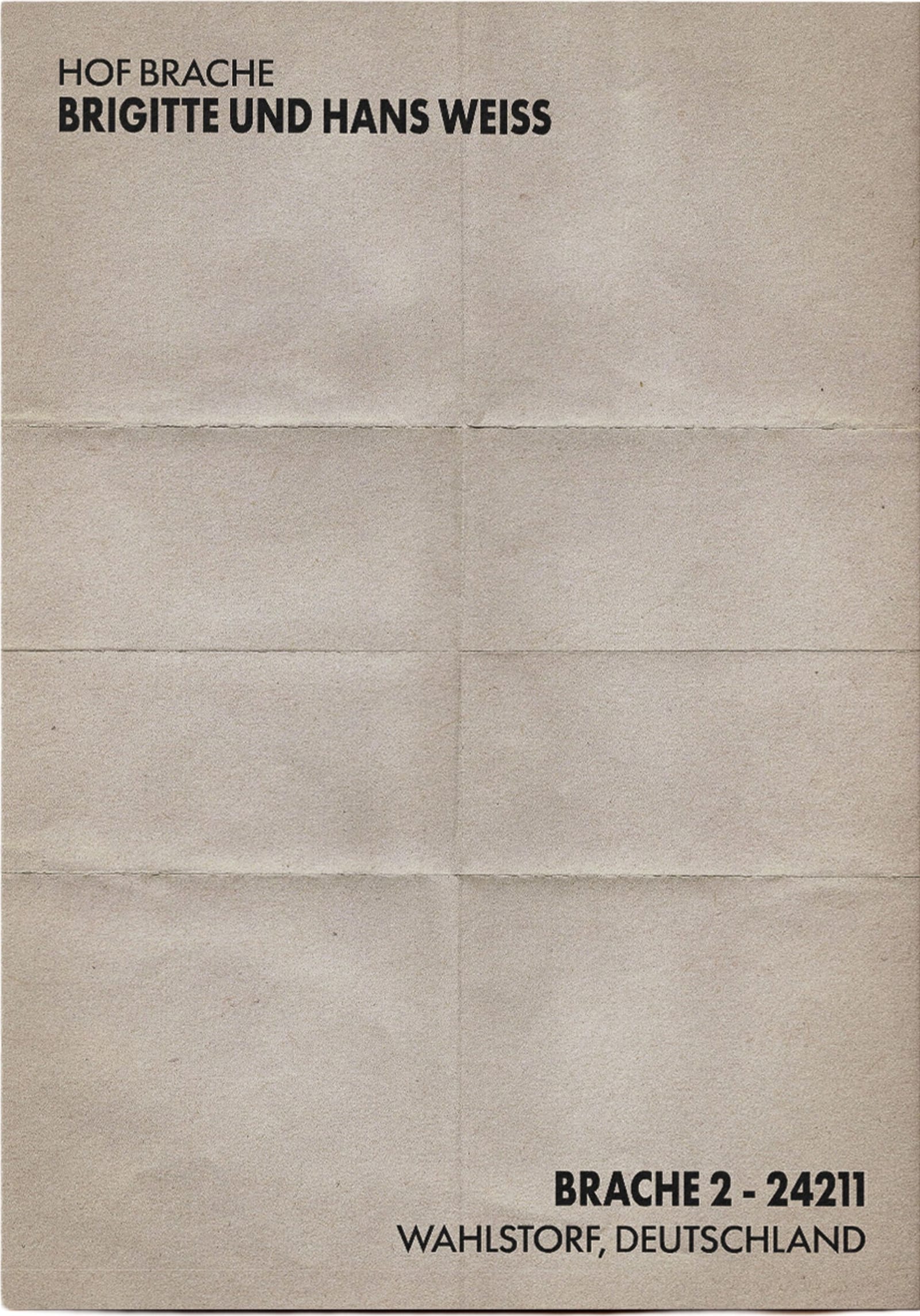
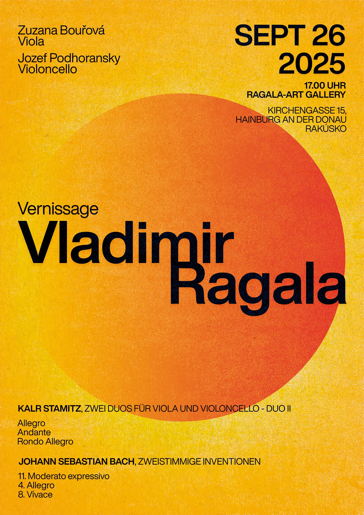
Four concerts, each with its own poster and printed programme. The client has since become a regular client, and I continue to design her concerts.
A 40-page book about indigenous peoples living in voluntary isolation, most of them in the Brazilian Amazon, and the ethical questions surrounding their existence.
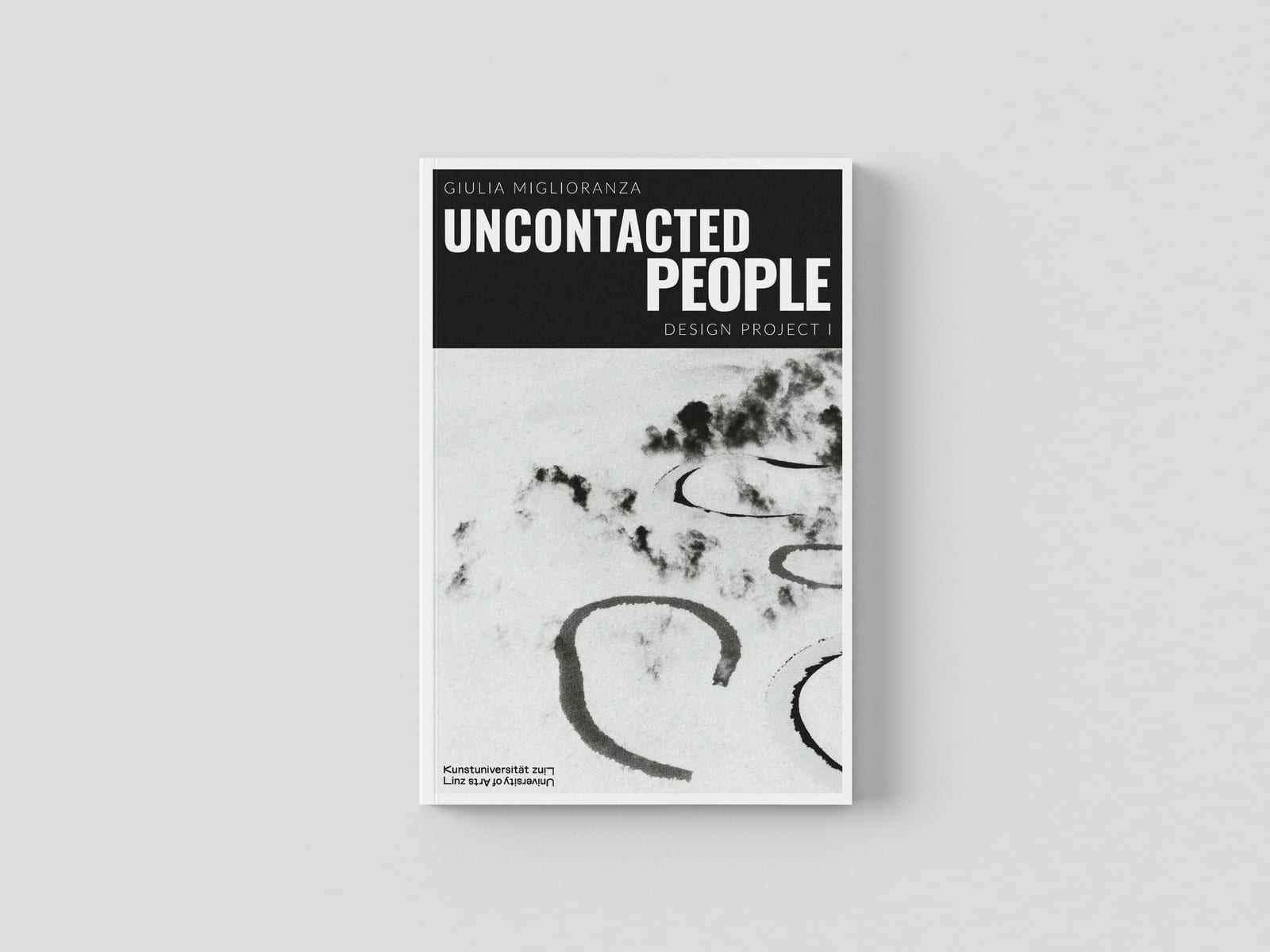
The text, based on a research article, deals with communities that have chosen to live without contact with the outside world. Since most of them live in the Amazon, I thought of Sebastião Salgado's photographs of the rainforest, which show the forest and its peoples with great respect. One of his photographs, stylised and edited to fit the book's visual language, became the cover and the starting point for everything that followed.
Instead of drawing traditional maps of the regions in the text, I let the cover guide the illustrations: every map is built from flowing, curved lines that echo the winding rivers of the Amazon in the photograph. This way, the maps and the cover speak the same language. The main focus of the project was book design: the typographic system, the grid and the layout of all 40 pages. I laid out the book in InDesign, illustrated the maps in Illustrator, then printed it as a booklet and bound it with a saddle stitch.
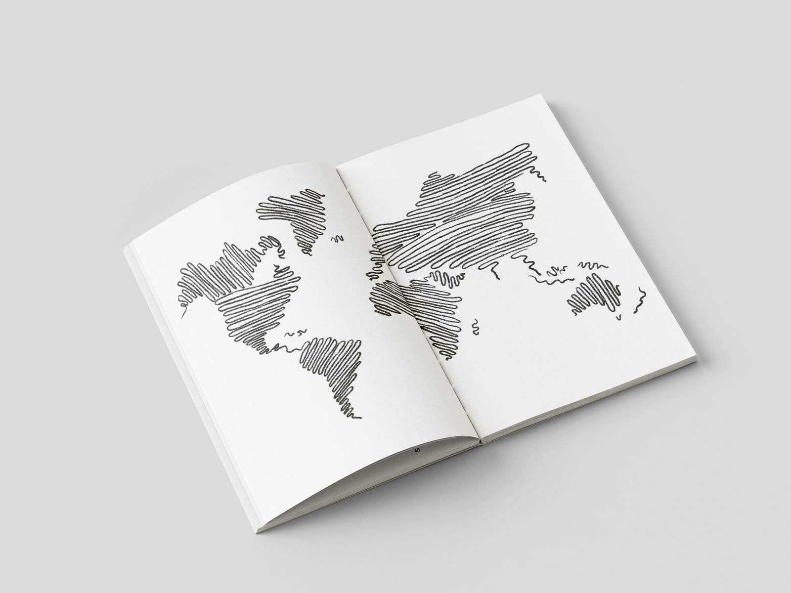
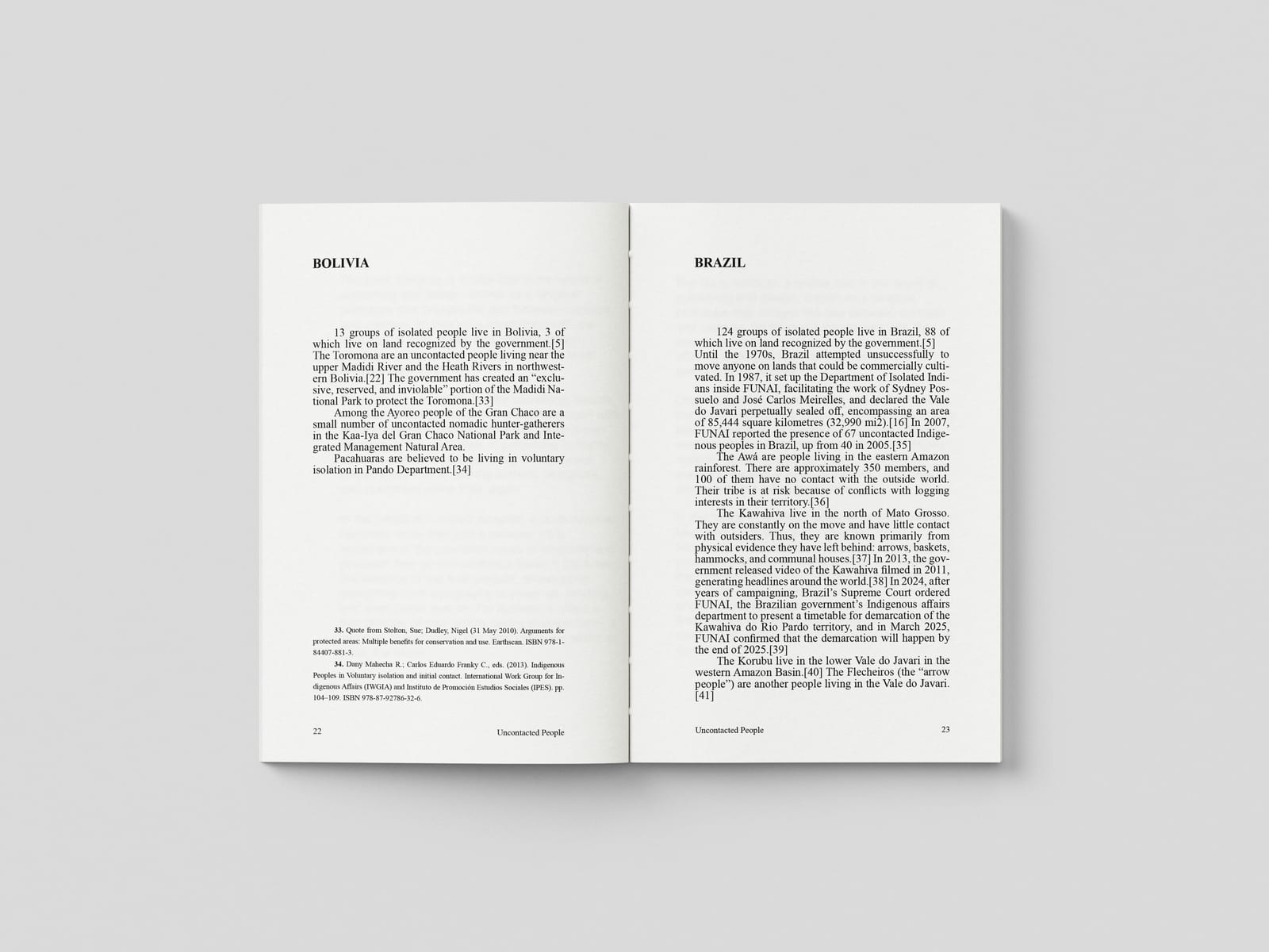
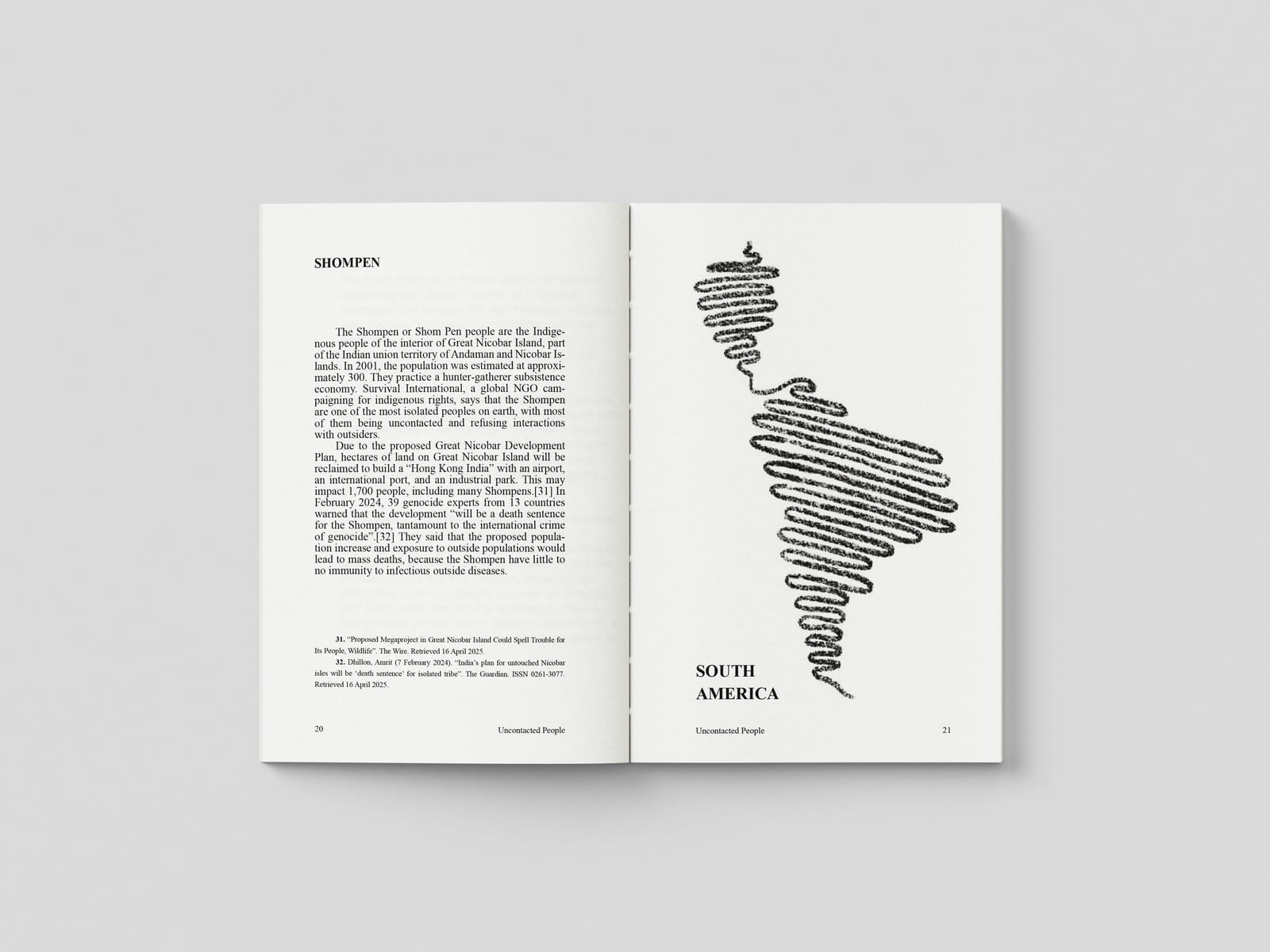
A finished 40-page publication in which cover, maps and typography form one consistent visual system.
A cordel-inspired zine about six figures of Brazilian folklore, with my own poems and illustrations. Unfolded, it becomes a poster.
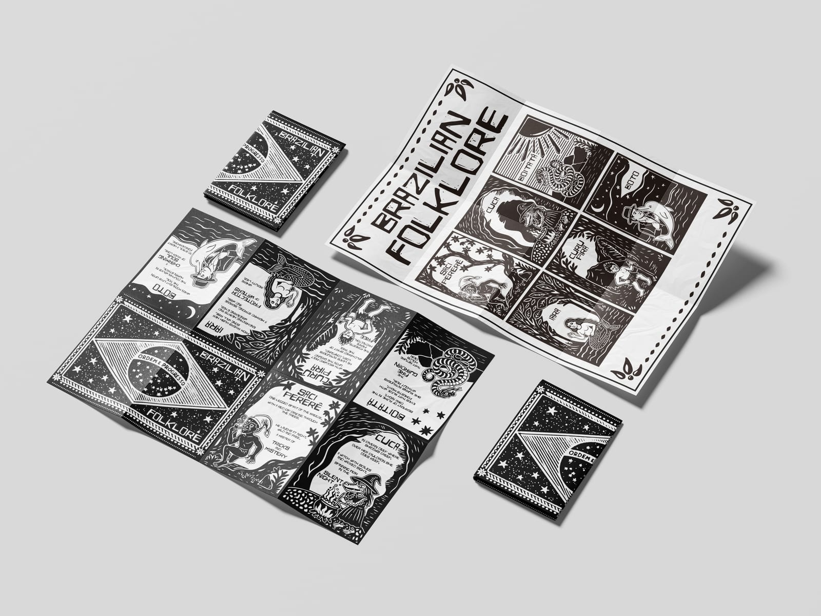
When the brief asked for a zine, I immediately thought of cordel. Literatura de cordel is a popular tradition from the Northeast of Brazil: small booklets of rhymed poetry, sold at markets hanging from strings (cordéis), with woodcut illustrations on their covers. I wanted to celebrate my own culture and share this tradition through the zine. It uses the language of cordel to tell the stories of six figures from Brazilian mythology: Saci, Cuca, Boitatá, Curupira, Iara and Boto.
I wrote a poem for each character and drew all the illustrations in Procreate, in the style of cordel woodcuts: black and white, bold shapes, strong contrast and simple, expressive figures. I then brought them into Illustrator, where I built the layout of the zine. It is printed on a single A3 sheet, front and back. Folded, it becomes an eight-page booklet: a cover, one page for each of the six characters, and a back cover. Unfolded, the reverse side turns into a poster.
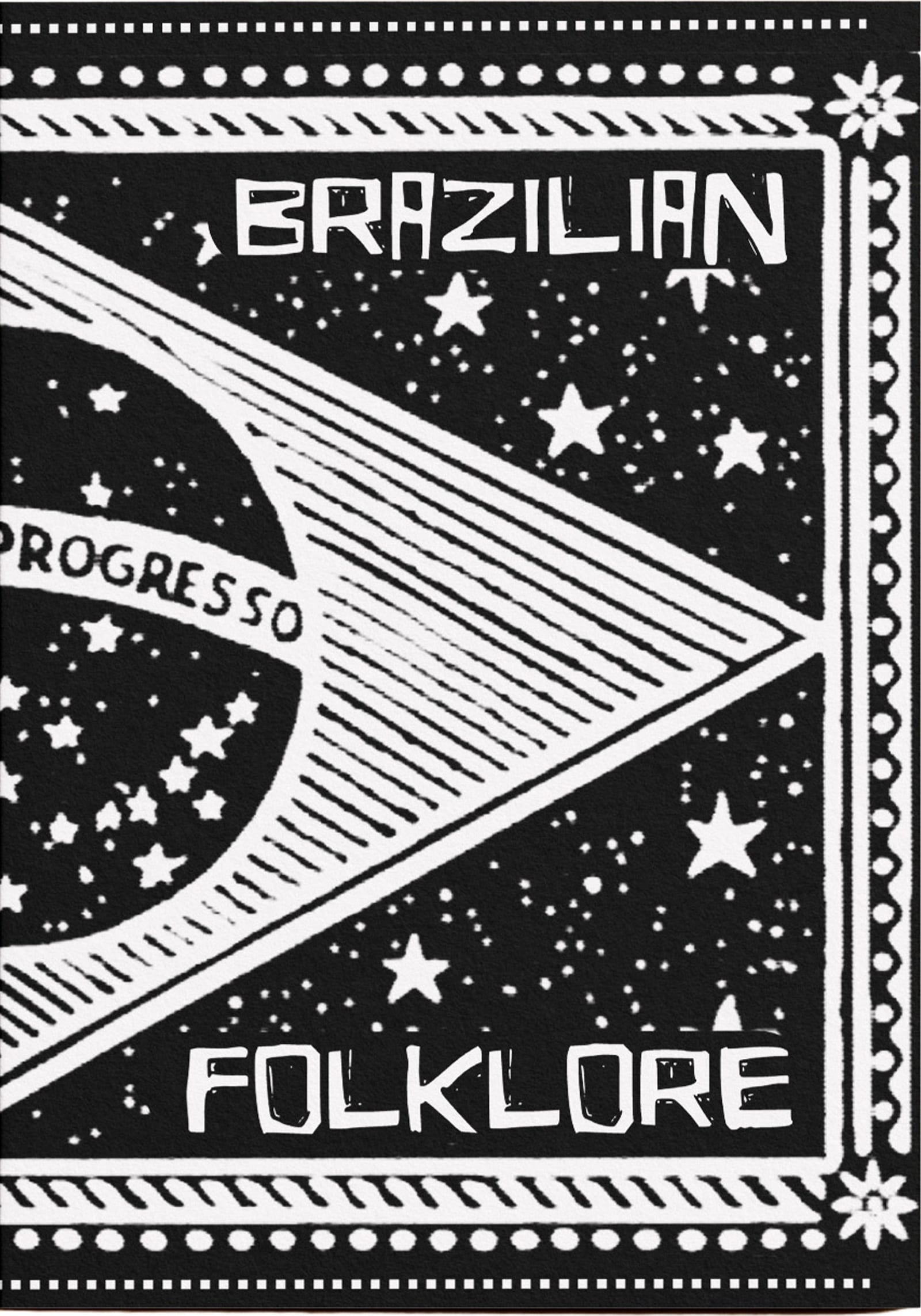
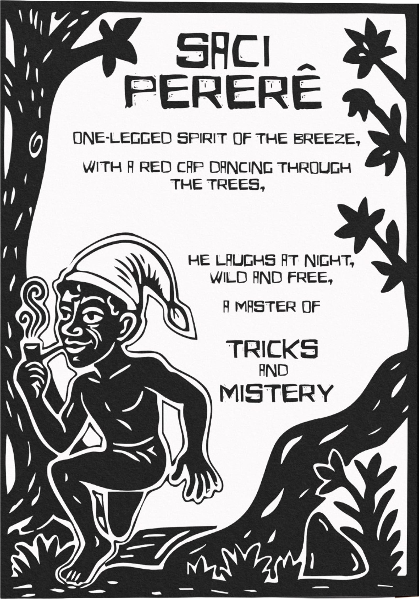
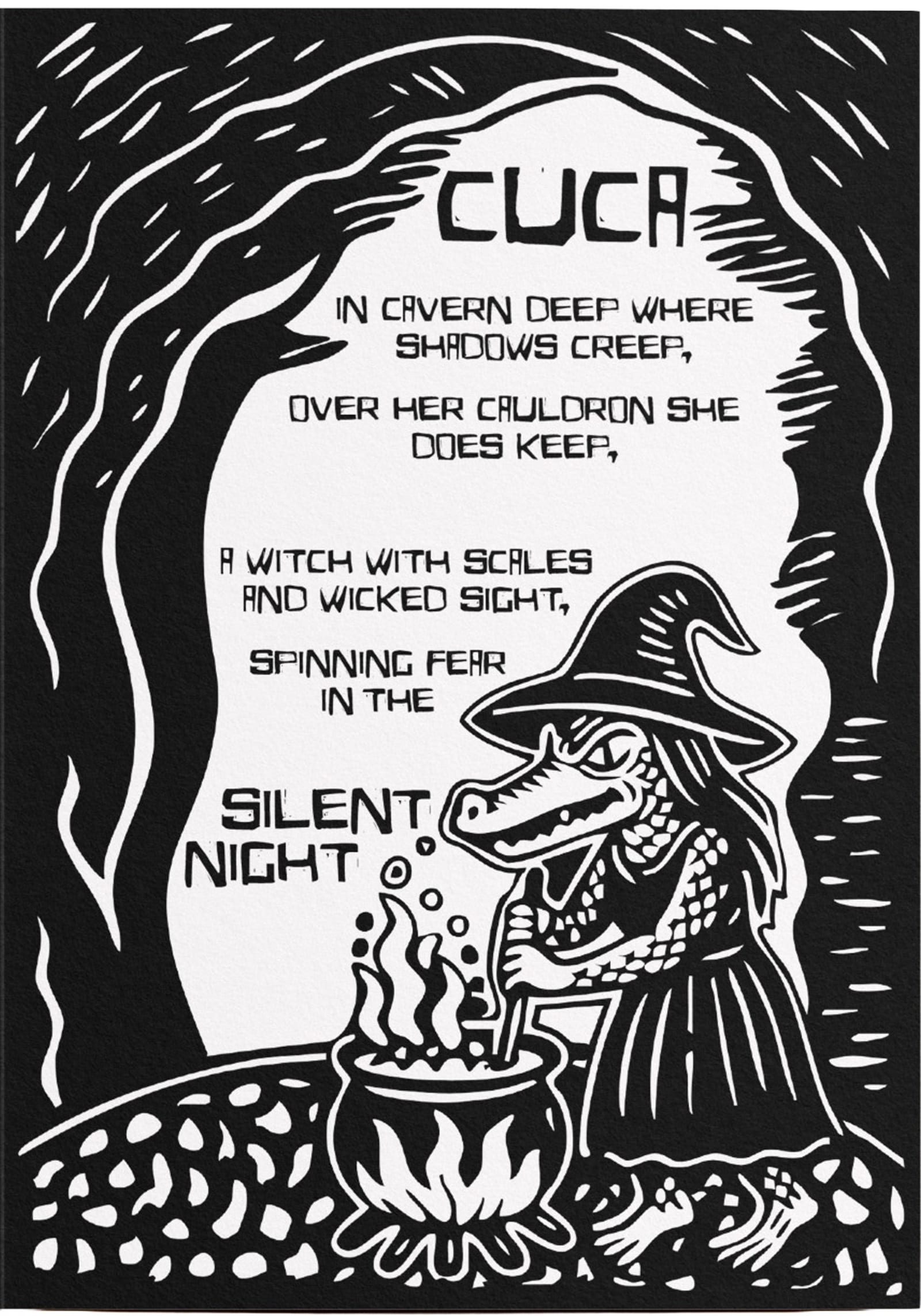
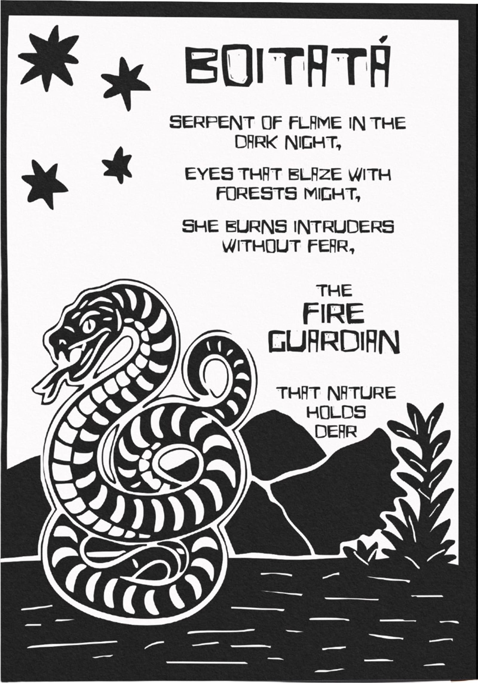
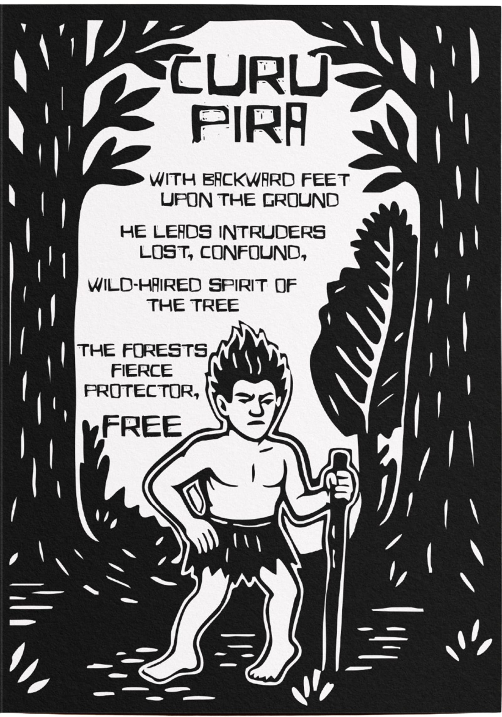
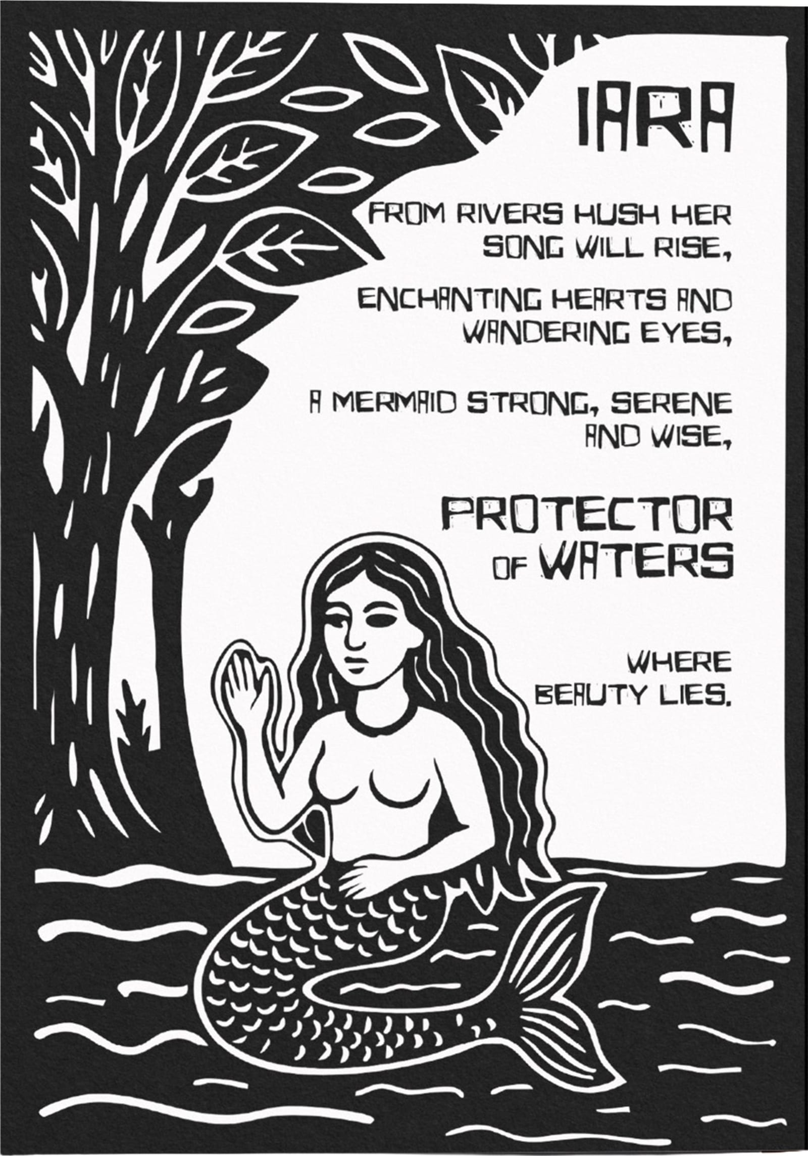
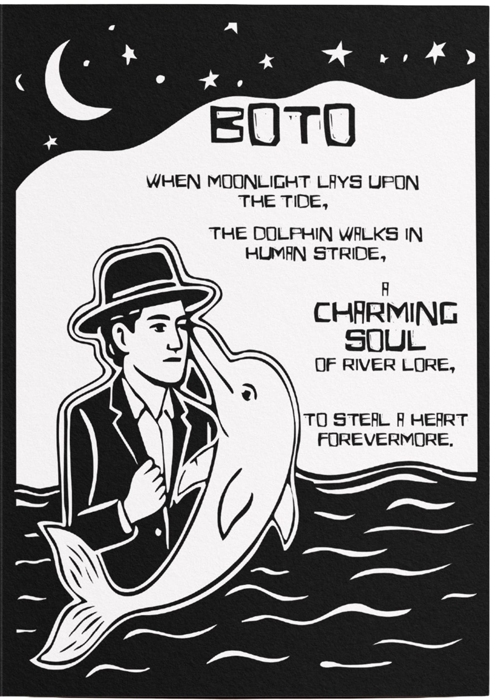
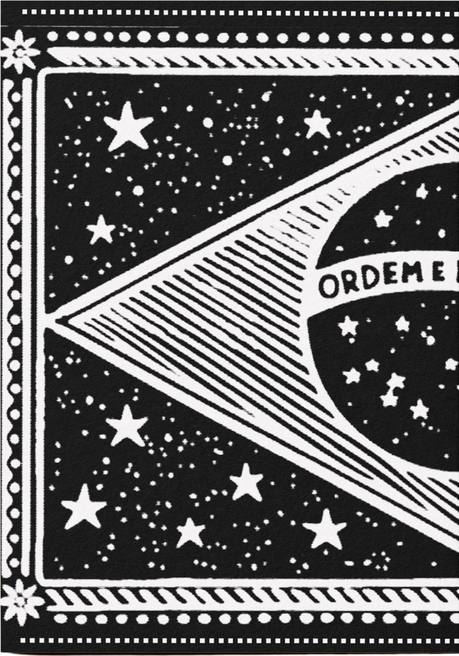
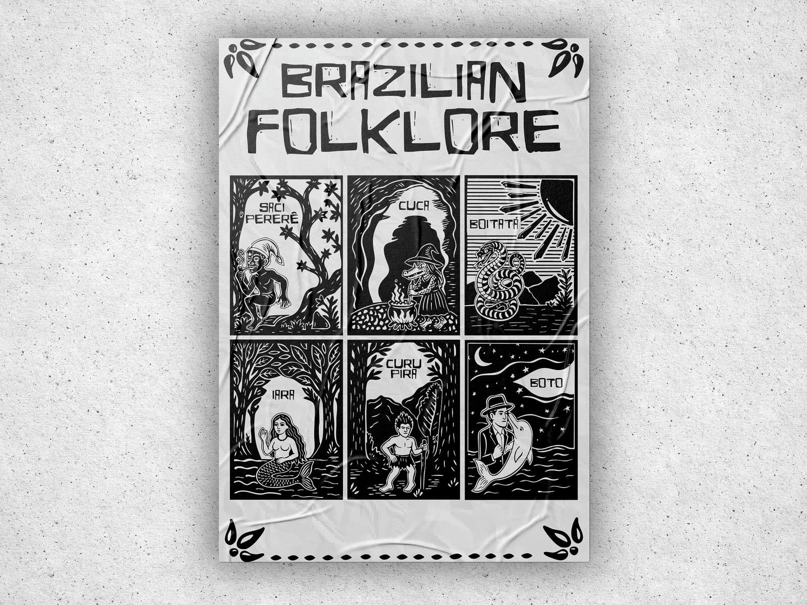
A finished zine that works in two ways: as an eight-page booklet and as a poster.
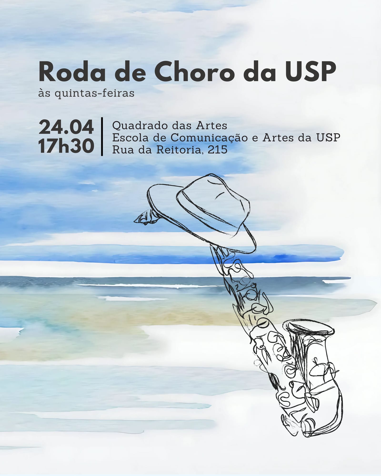
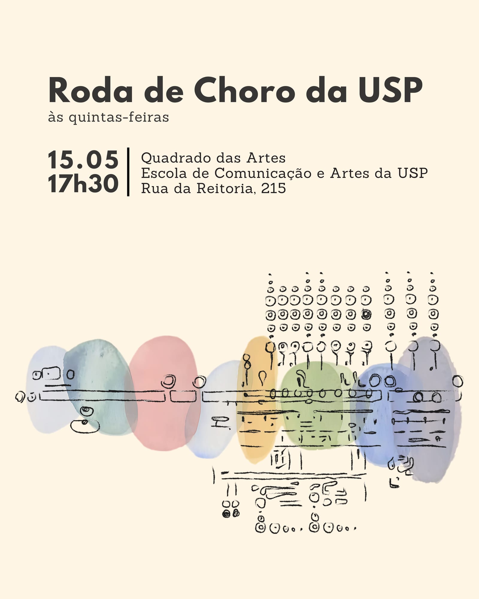
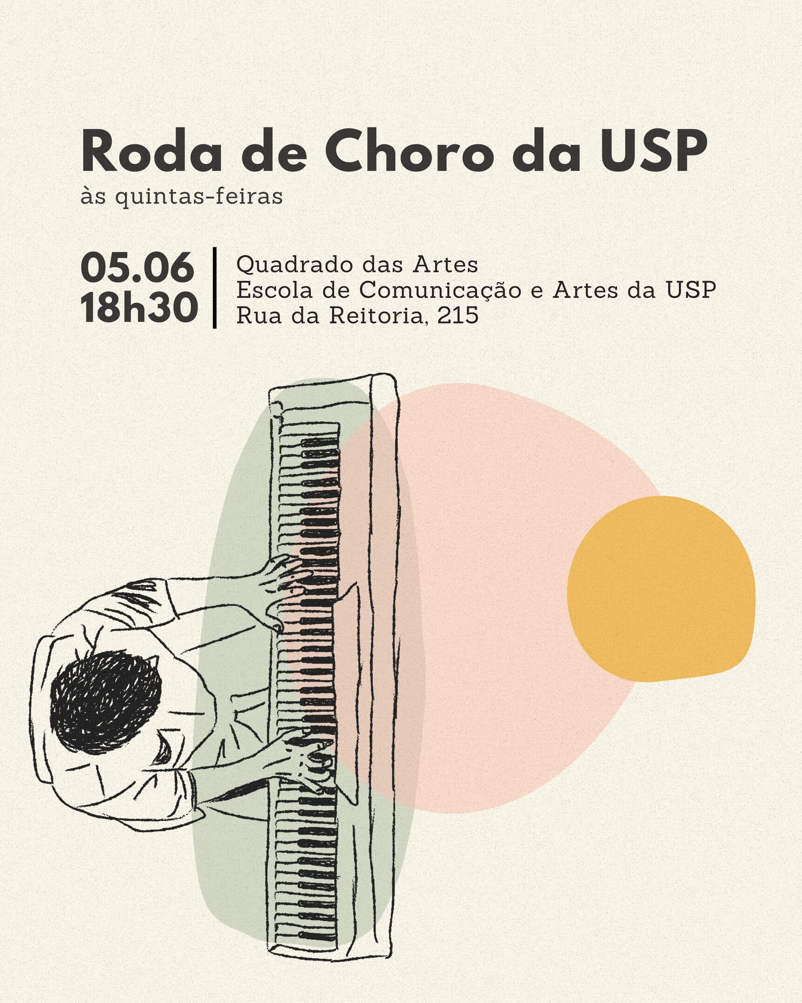
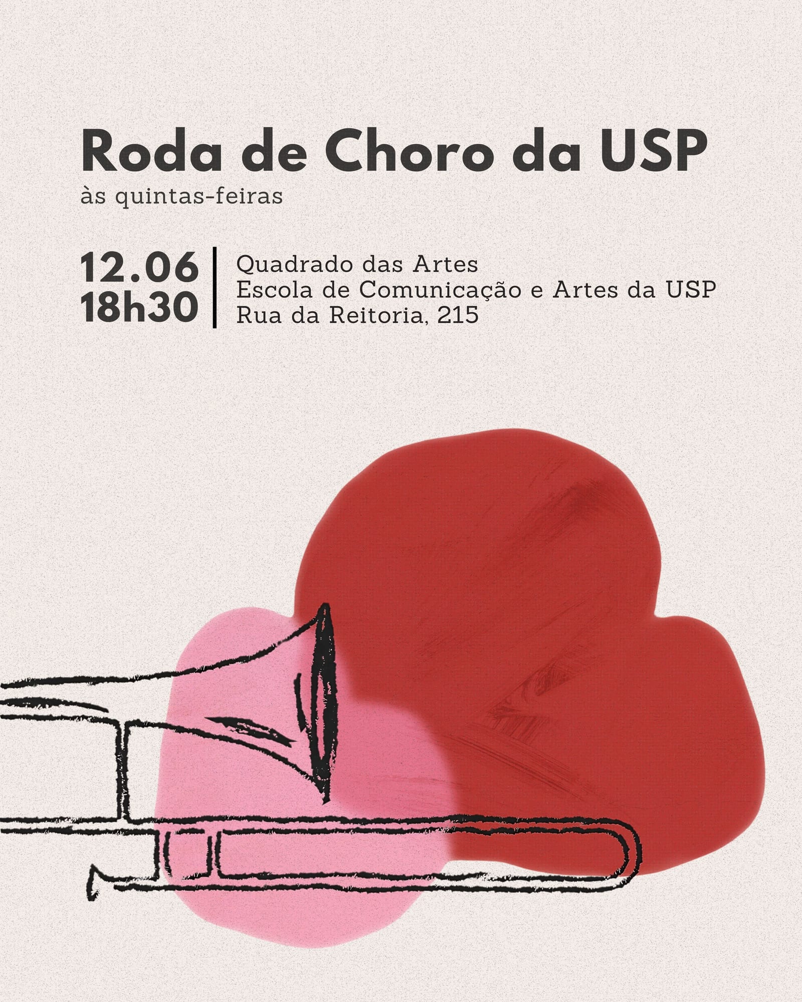
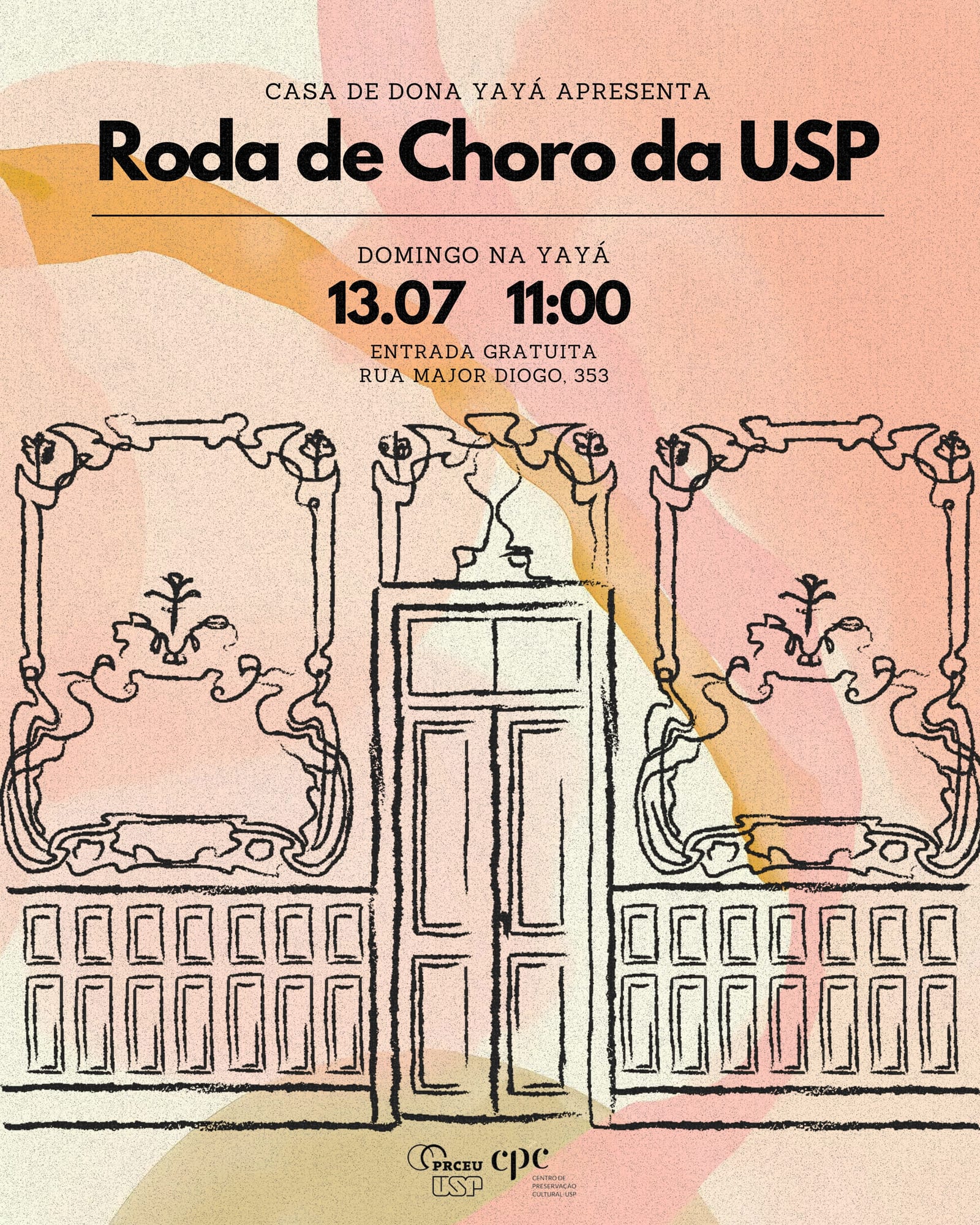
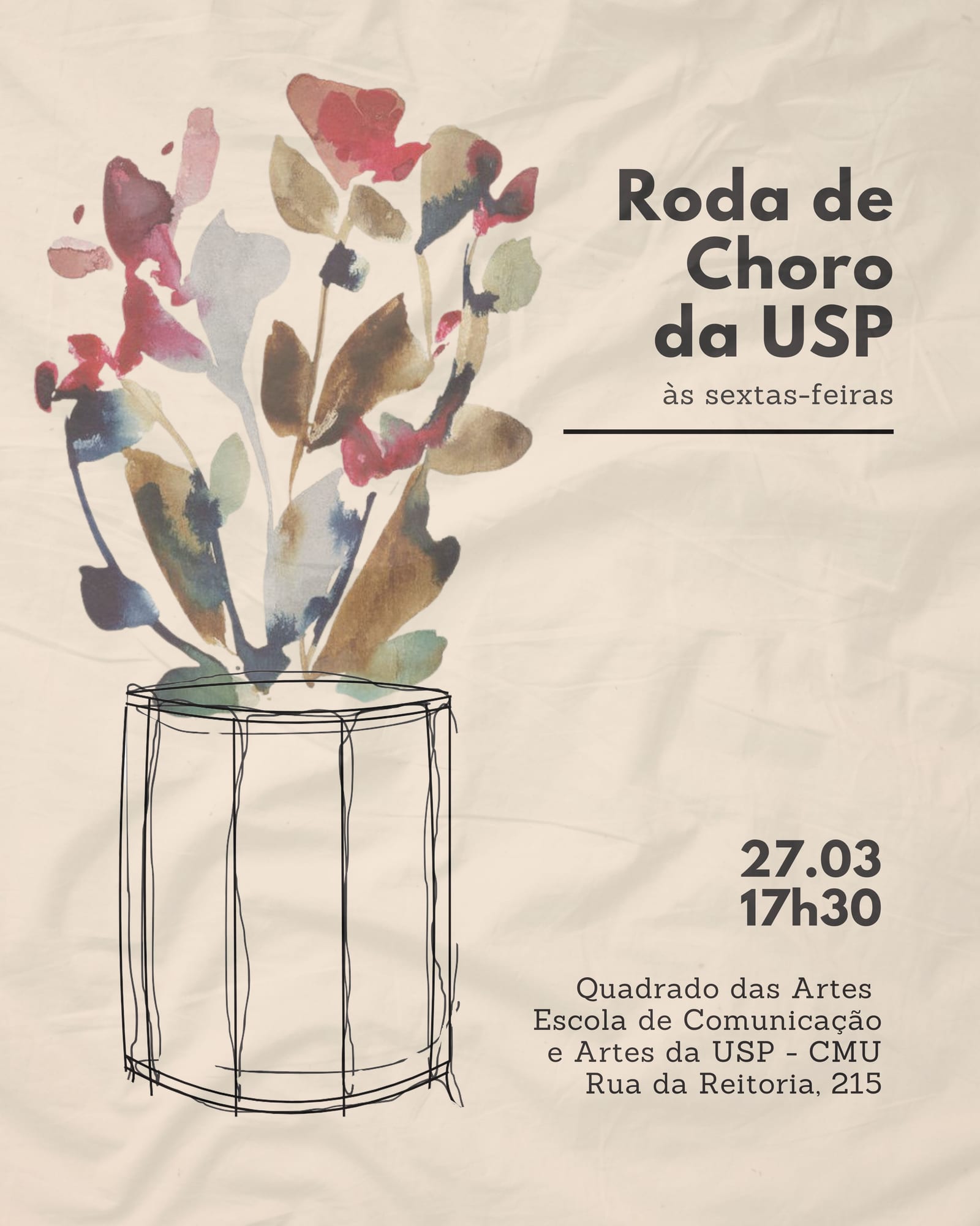
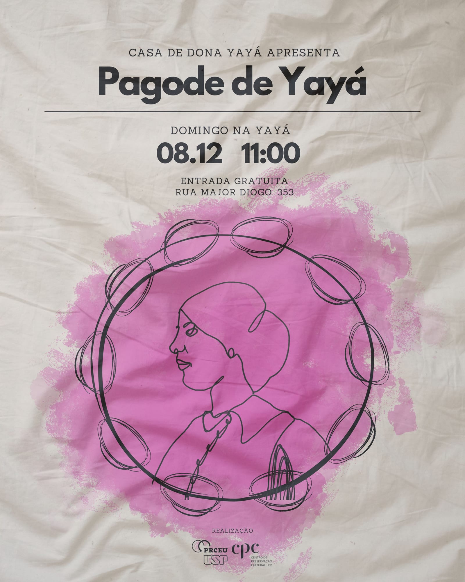
More than 30 event posters for a university choro ensemble in São Paulo, which together became the group's visual identity.
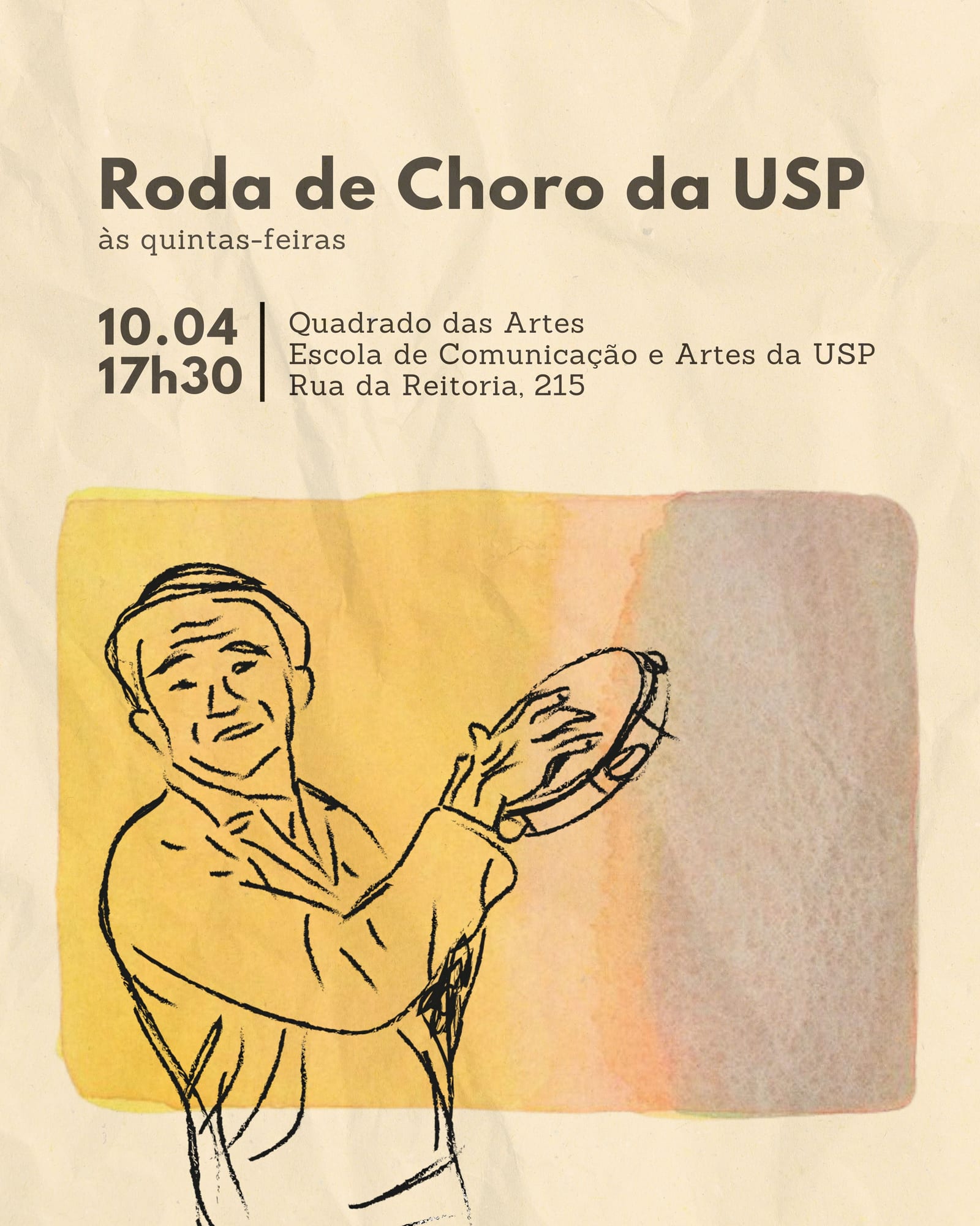
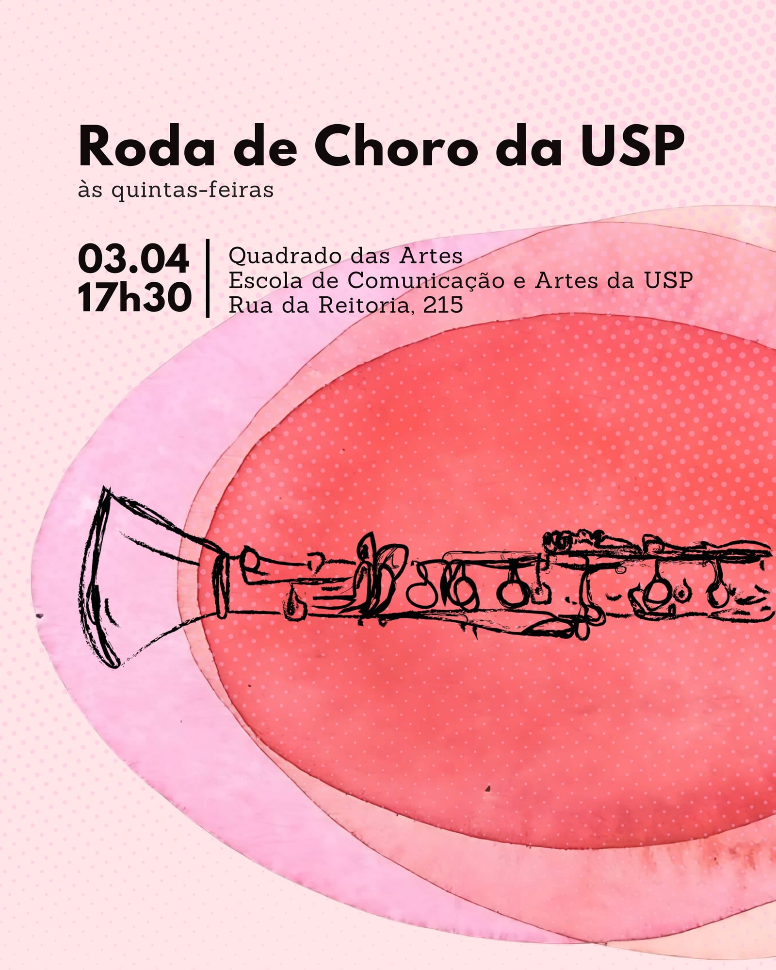
01 / 09
The Roda de Choro da USP was founded in 2023 to study, play and preserve choro, a traditional Brazilian music genre born in the 19th century and a central part of the country's musical heritage. The group holds weekly sessions and concerts, and needed a way to announce them that also gave the project a recognisable face.
Every week I designed a poster for the next event, each one featuring an illustration of a typical choro instrument. Most illustrations were drawn digitally in Illustrator; others were drawn by hand, scanned and vectorised. Throughout the project, I kept the same typography and illustration style across every poster, so the series grew into a consistent visual language for the group.
The identity is still in use today: the group's posters and social media posts keep the same typography and illustration style.