
1/6
Category
3 Projects
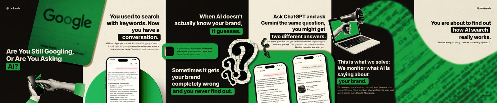
A brand system for a Vienna-based AI visibility (GEO) startup, built from an existing logo into a complete visual identity.
01 / 08
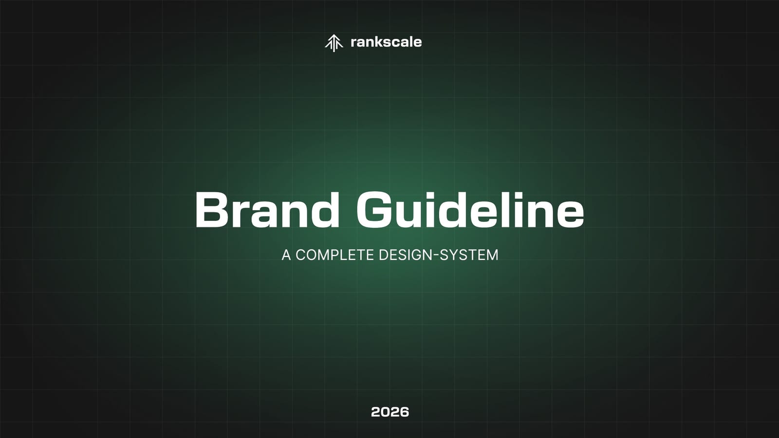
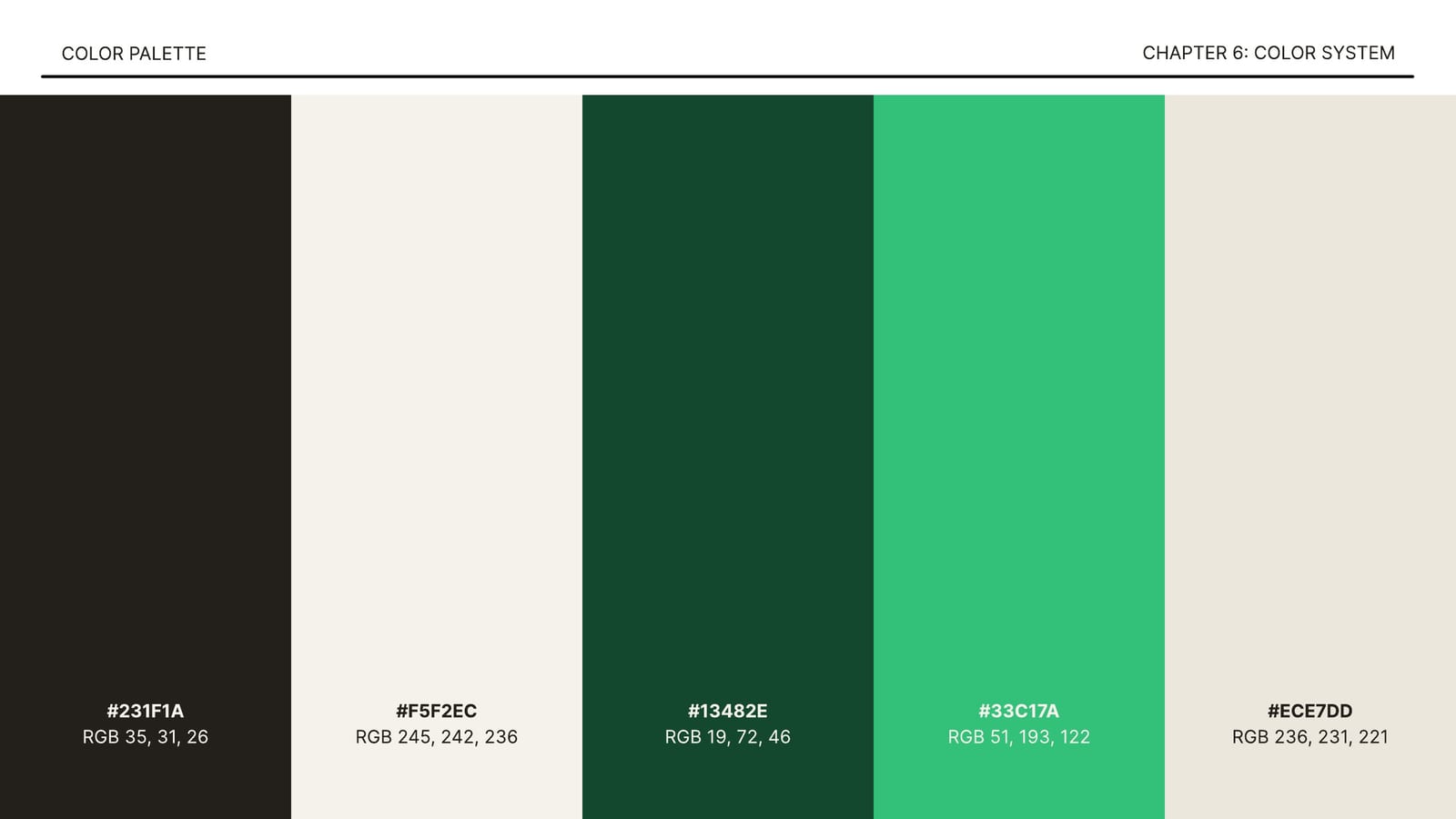
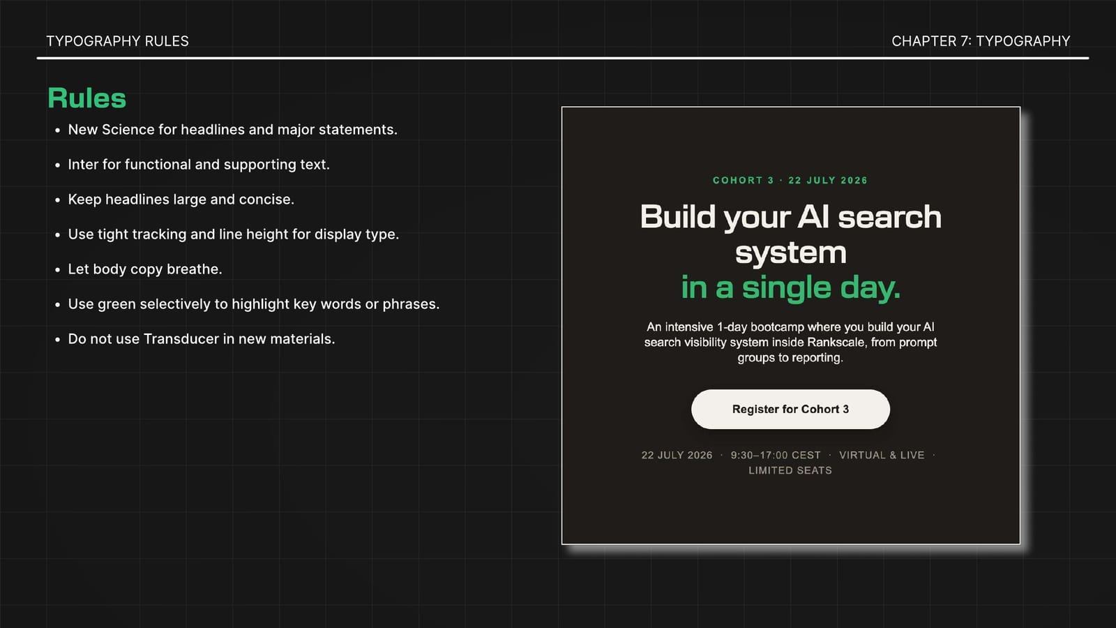
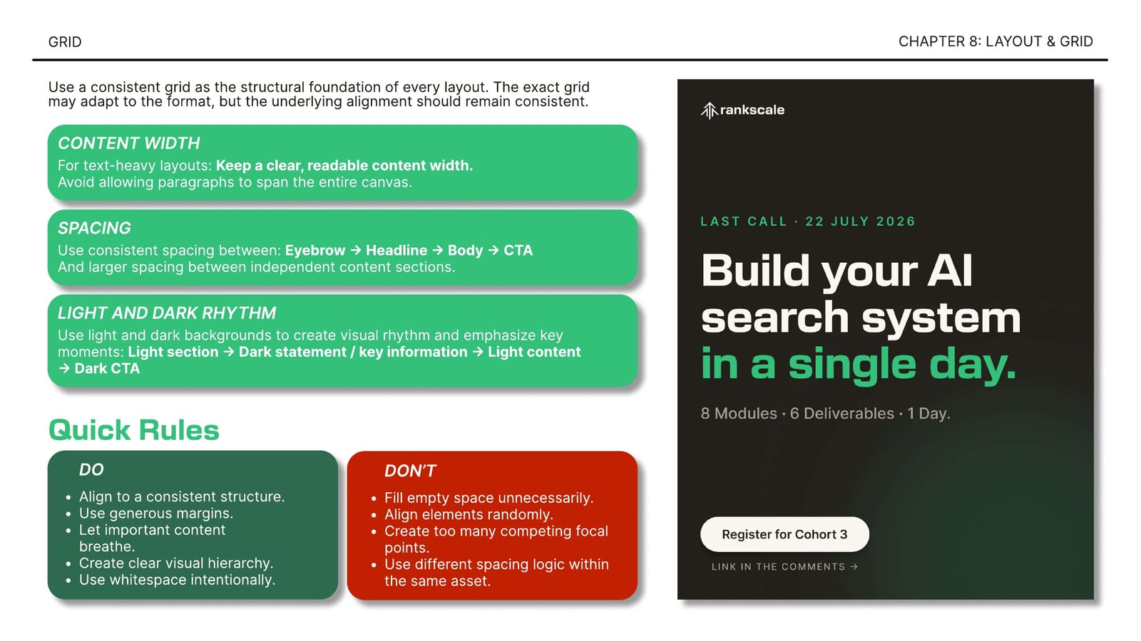
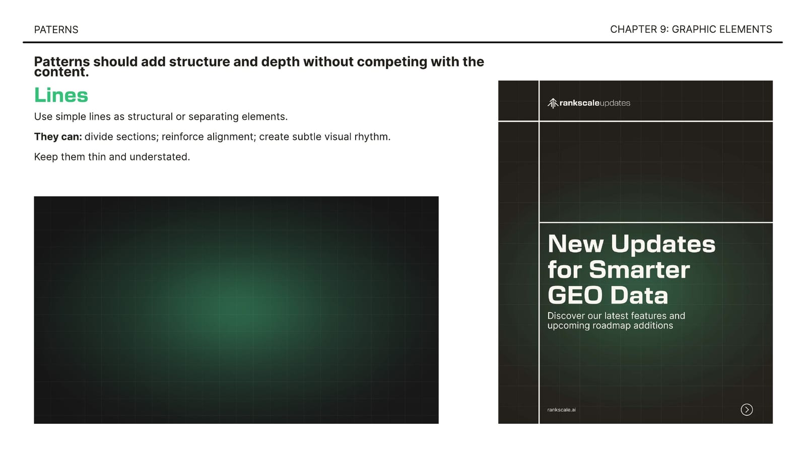
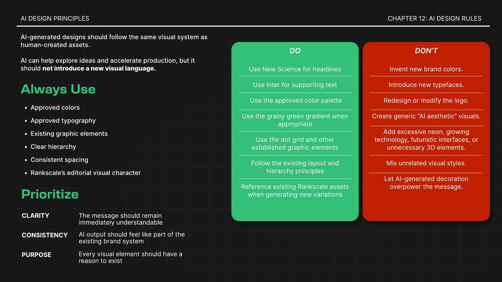
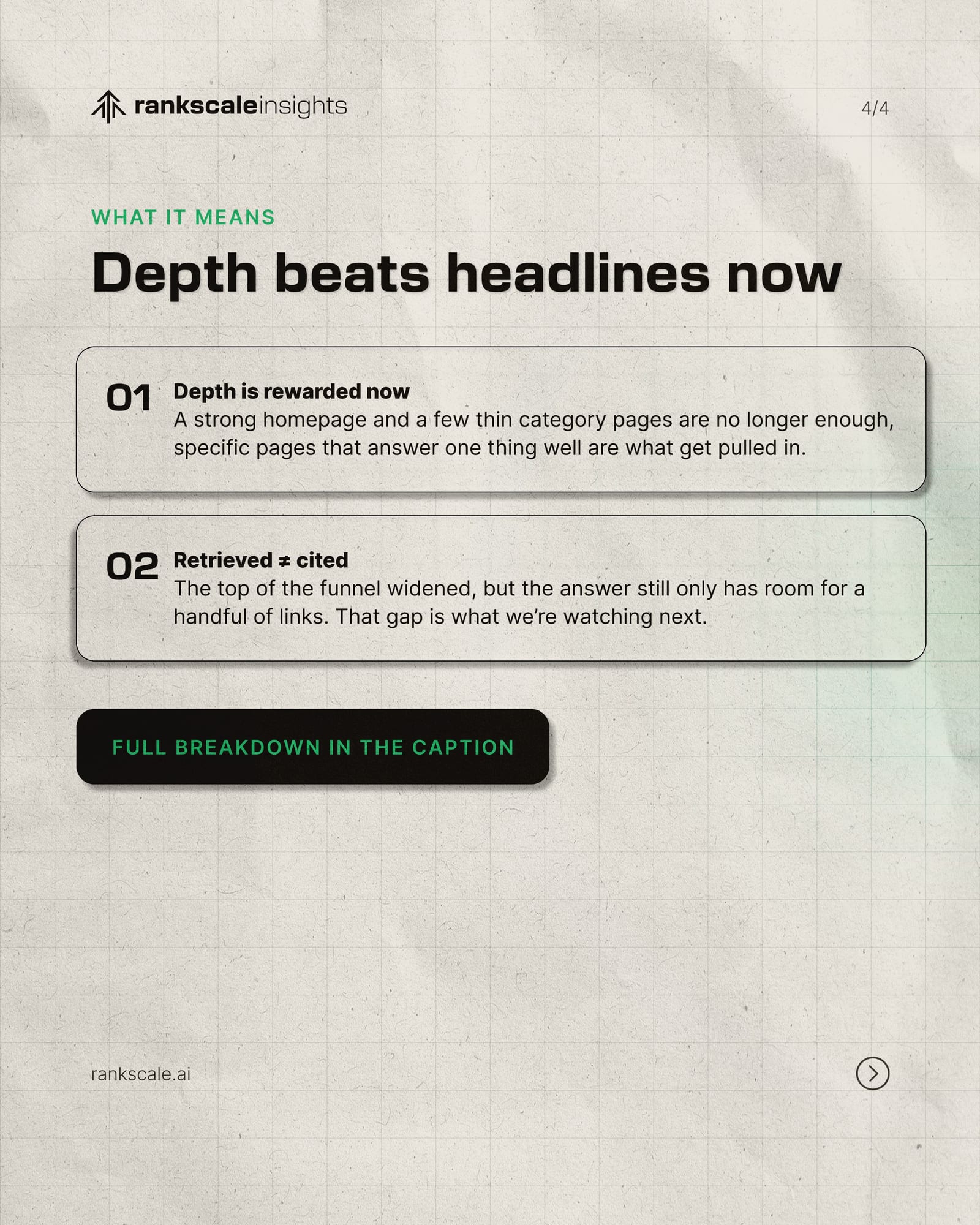
Rankscale already had a logo and a website, but no real brand guidelines. Every new piece was designed from scratch, and the look changed from one channel to the next. The goal was to give the brand a consistent, coherent visual identity across all of its communication, from print to digital, through a clear set of rules that the team and the AI tools they work with could apply reliably.
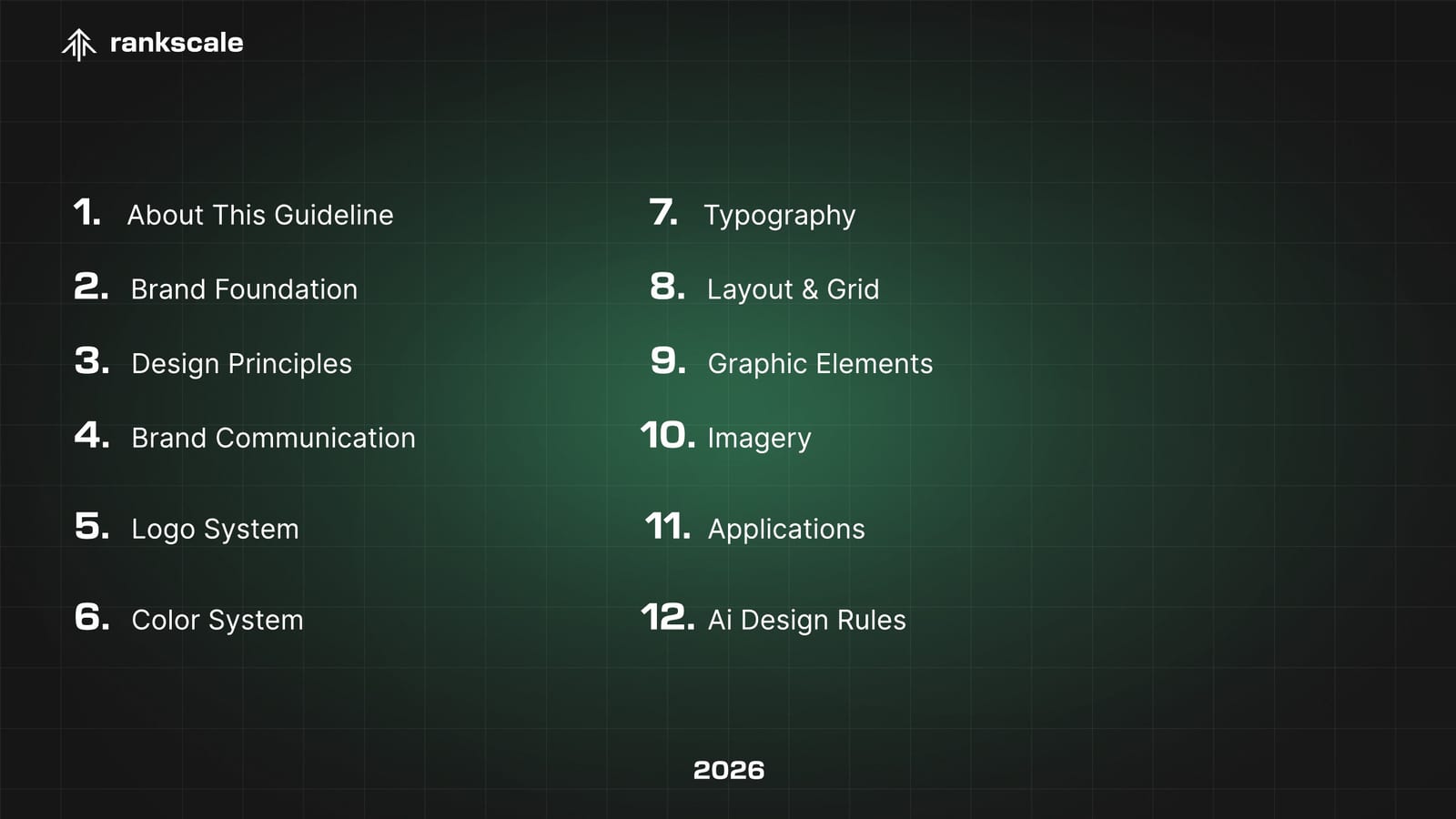
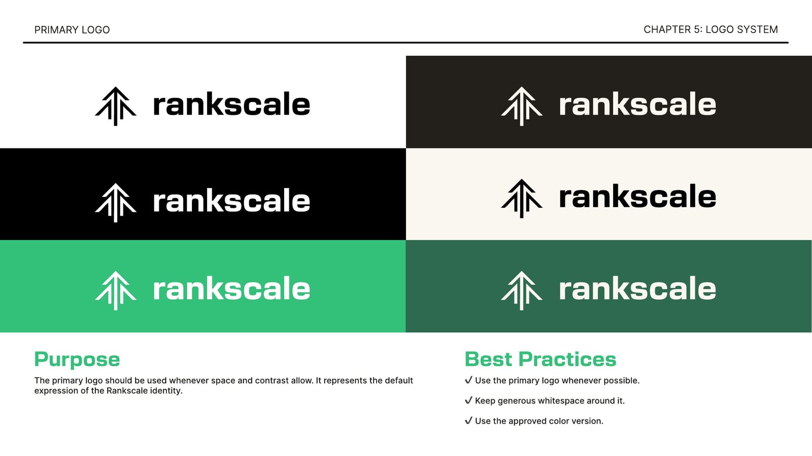
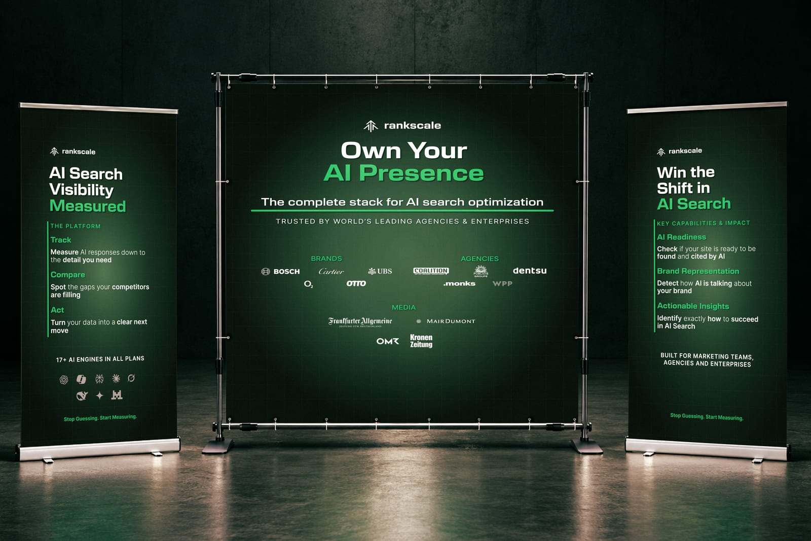
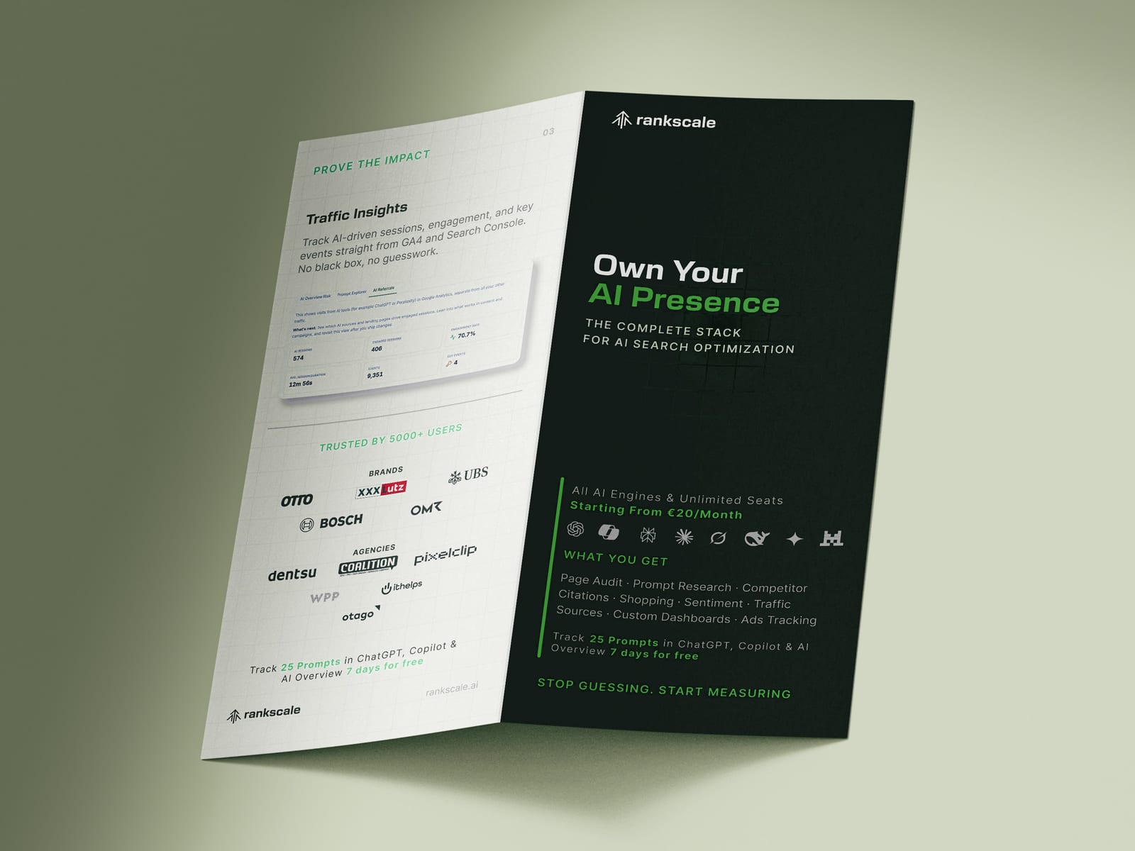
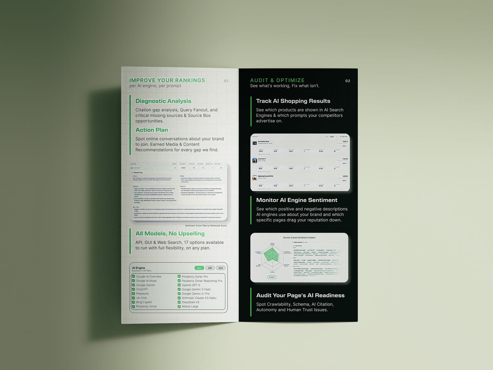
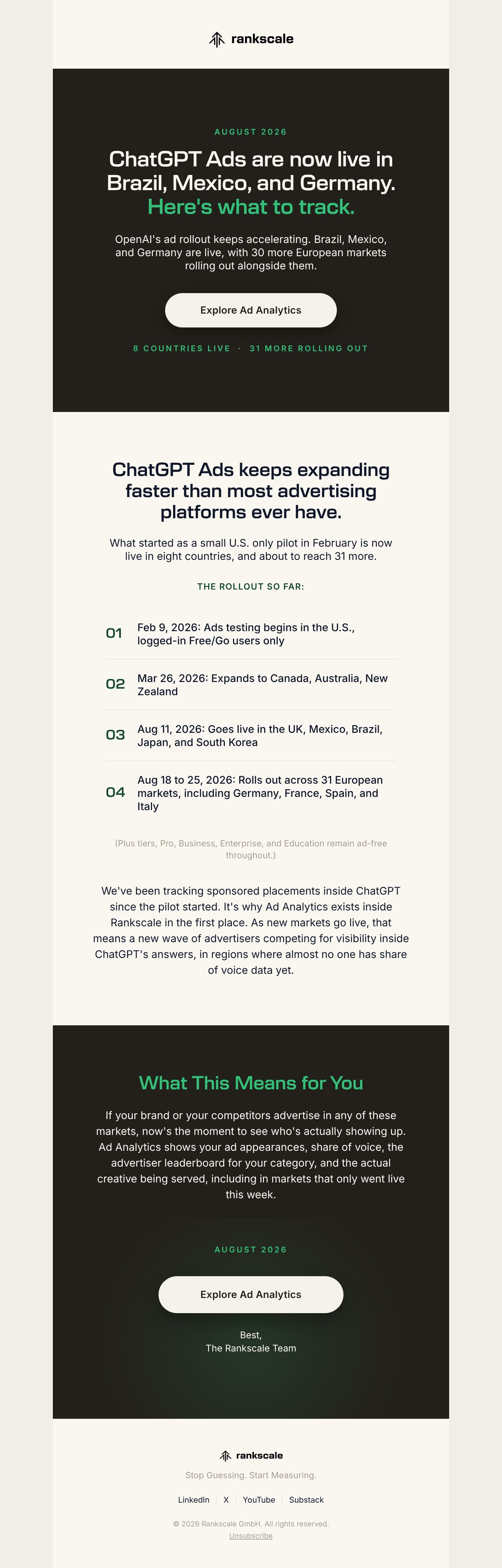
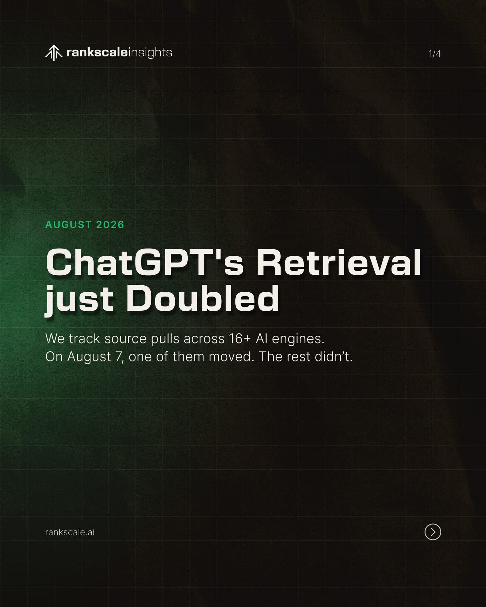
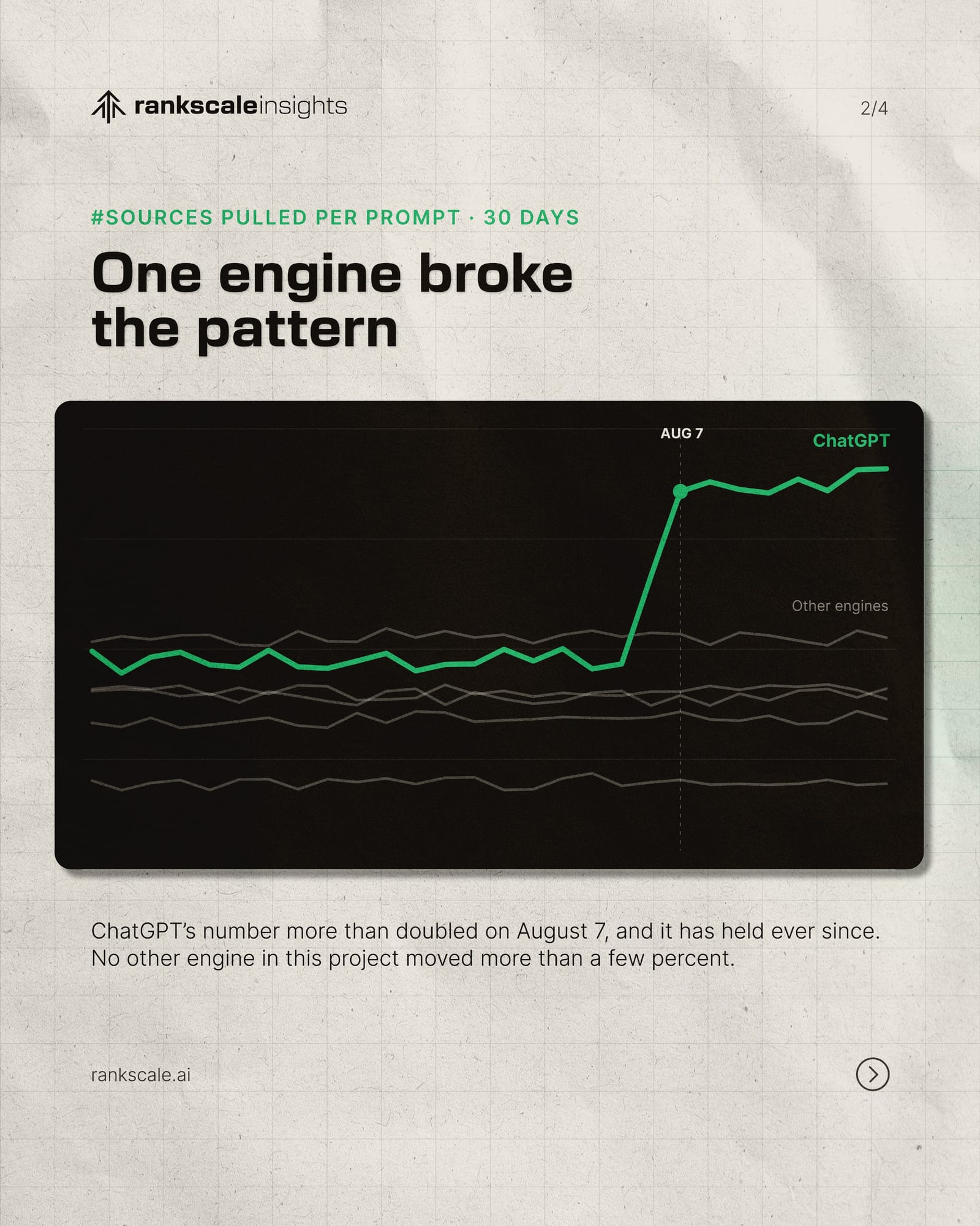
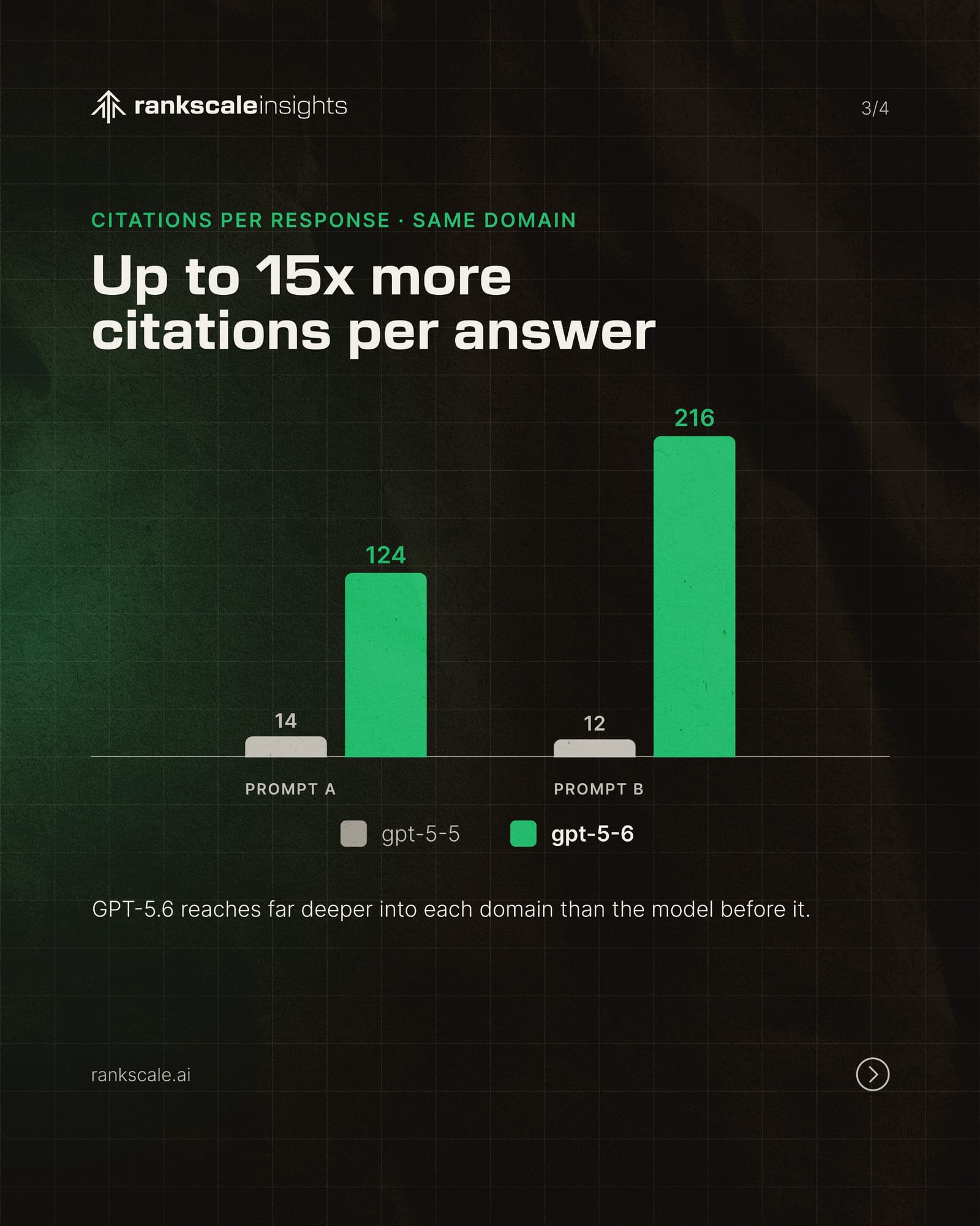
Starting from the existing logo and website, I defined the brand guidelines and design system: colour, typography, layout rules and reusable components. I then applied the system across the brand’s touchpoints: event materials such as roll-ups, flyers and a backwall, pitch decks and presentations, LinkedIn content, and email templates that I designed and coded in HTML and CSS.

01 / 04
01 / 06
The brand guidelines became the reference for Rankscale’s visual communication, giving the team one consistent look from print to digital.
A Year in Linz: four labels for the limited-edition Linzer Beer Specialties 2026, each one an emotion tied to a season and a place in the city. Awarded second place.
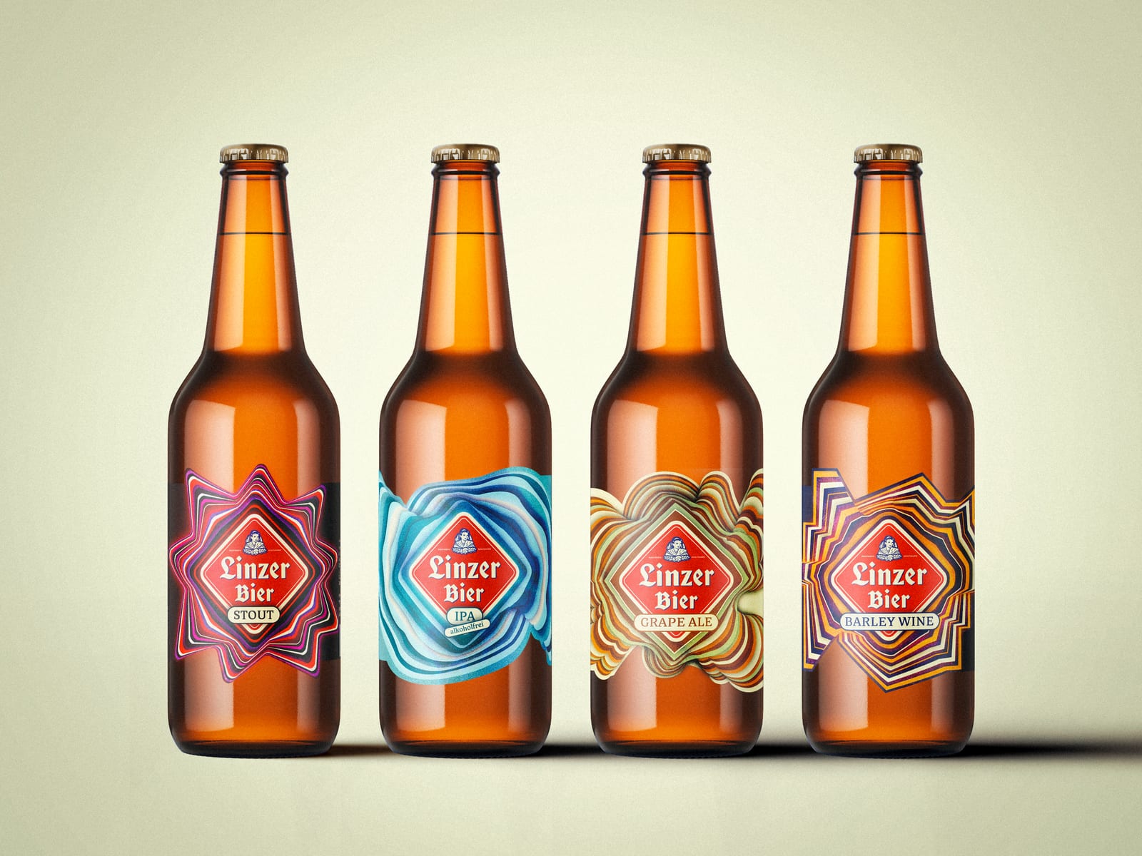
Drinking a beer is never just about the drink. It is about the moment around it: the people beside you, the memories being made, the city that surrounds you. The concept connects three things for each beer: the emotion it evokes, a landscape of Linz, and the season in which it is released.
Landscapes and seasons are easy to picture, but emotions are abstract and personal. So we asked what feelings look like, and turned each one into an abstract form that merges with the diamond shape of the Linzer Bier emblem, the anchor of every moment. Colours come from the taste of each beer and its landscape, while layered light and shadow add depth and a three-dimensional effect.
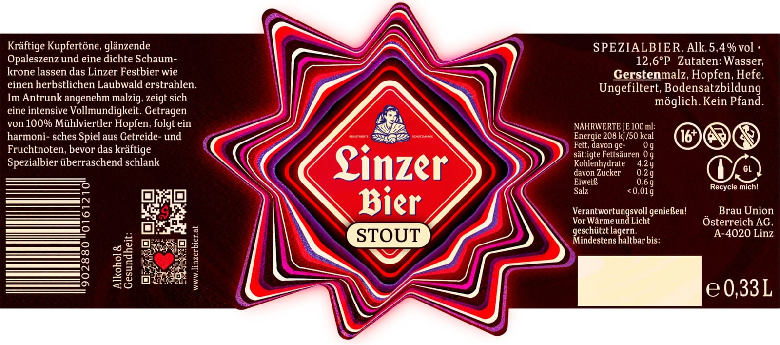
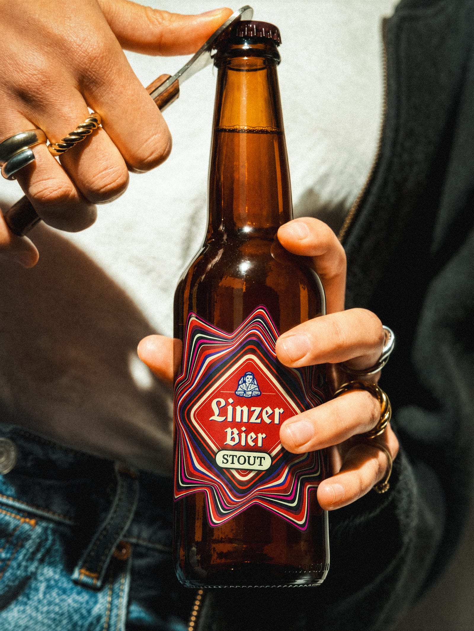
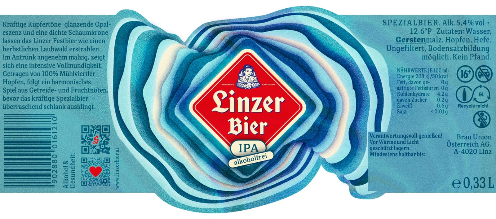
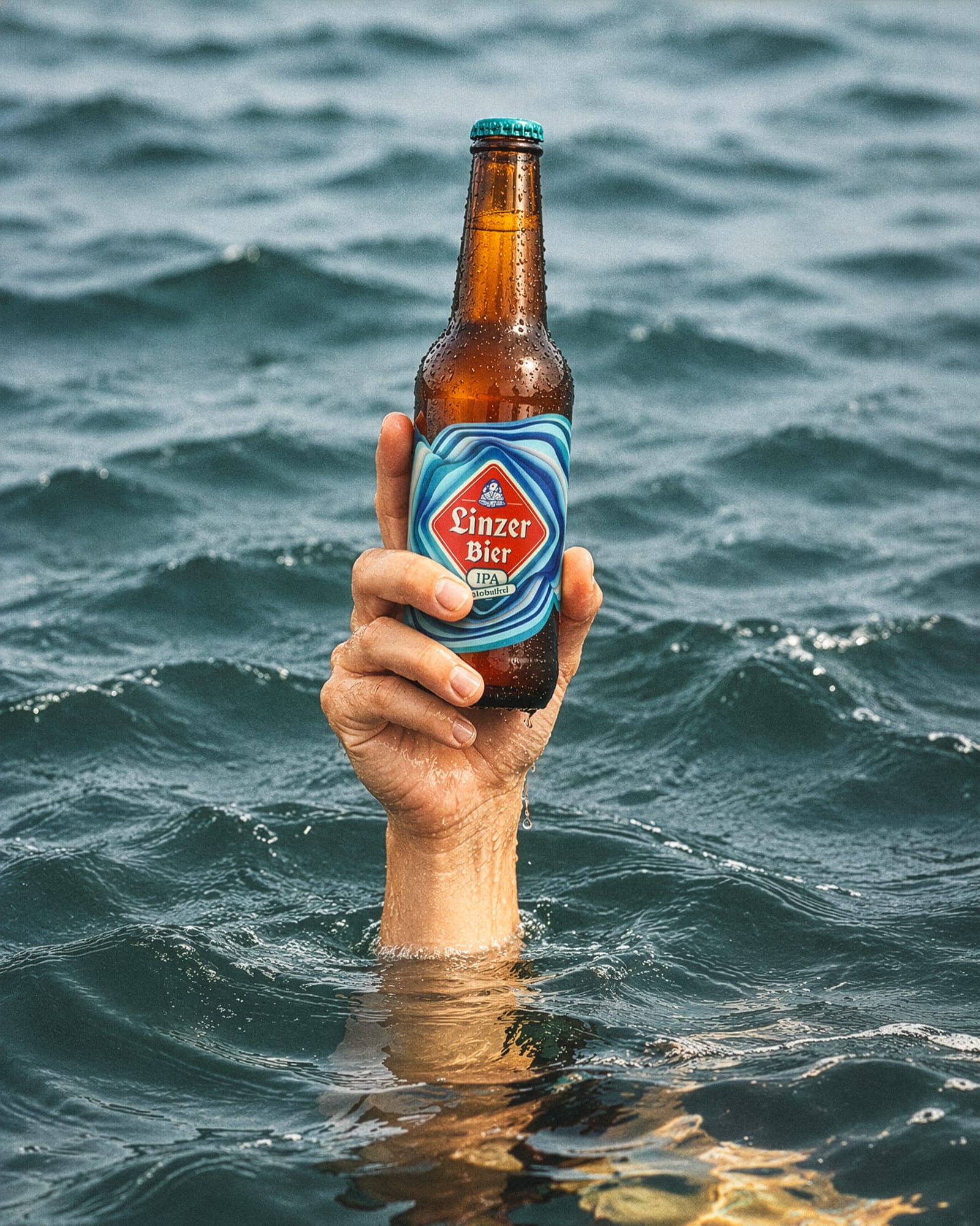
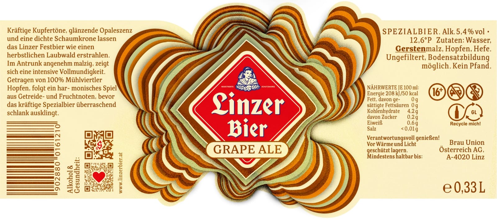
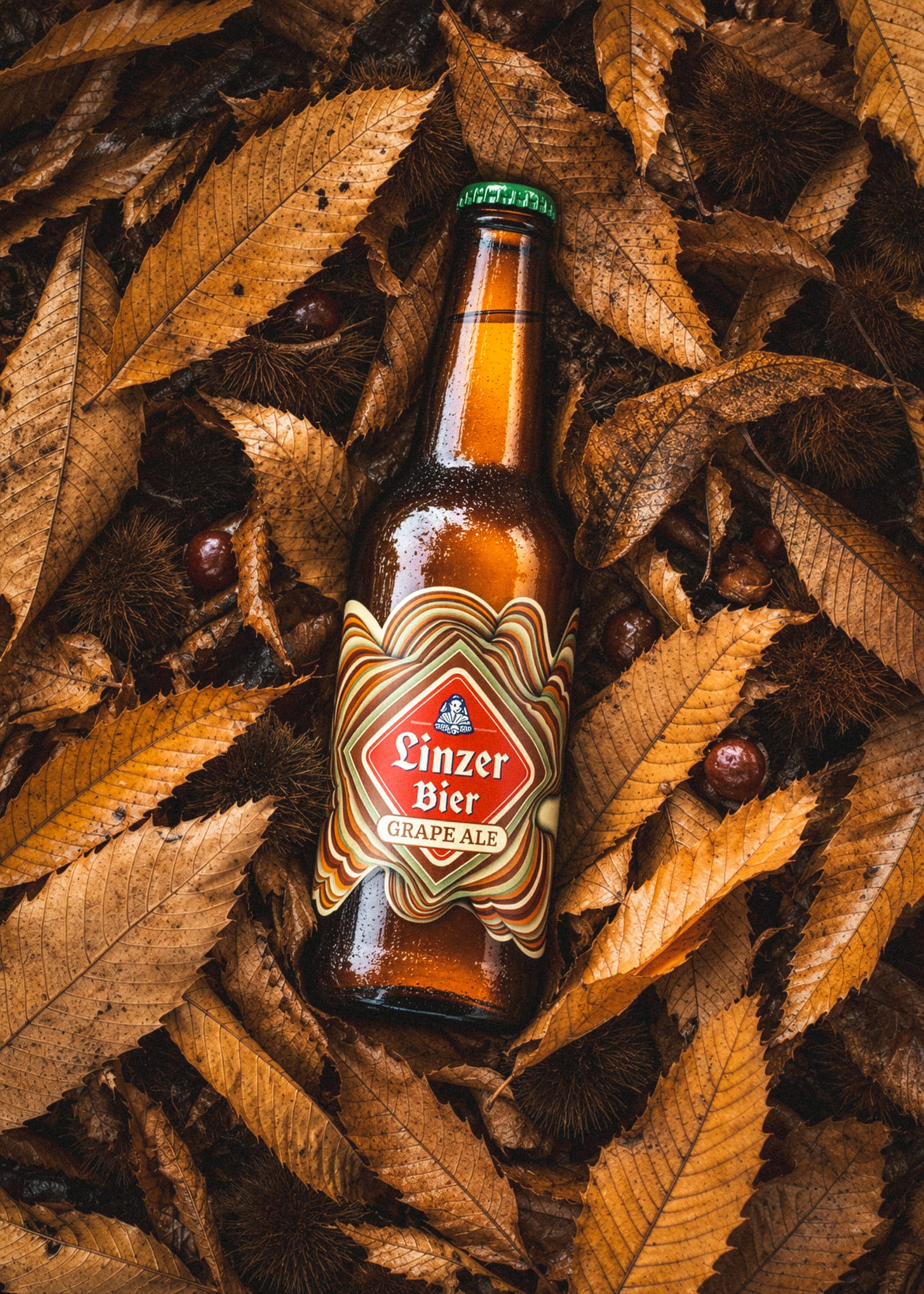
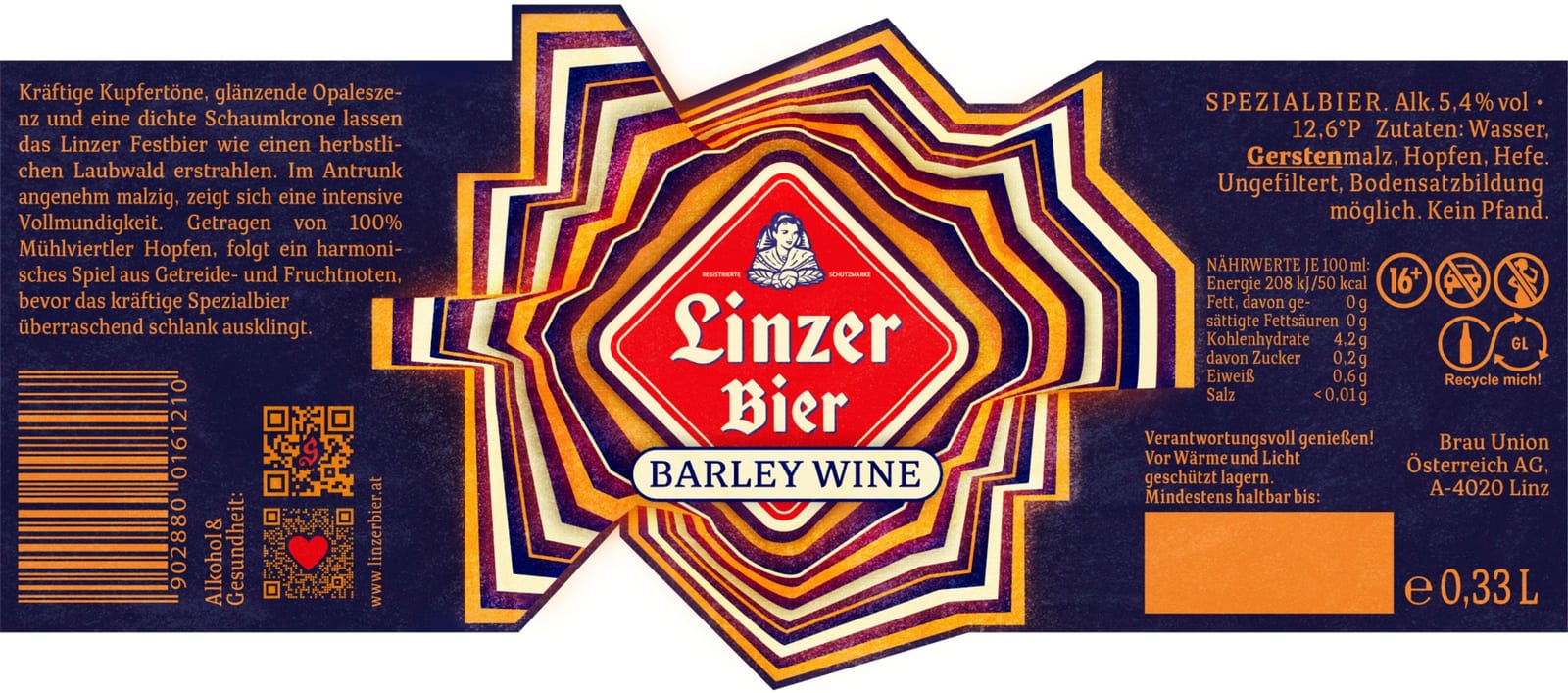
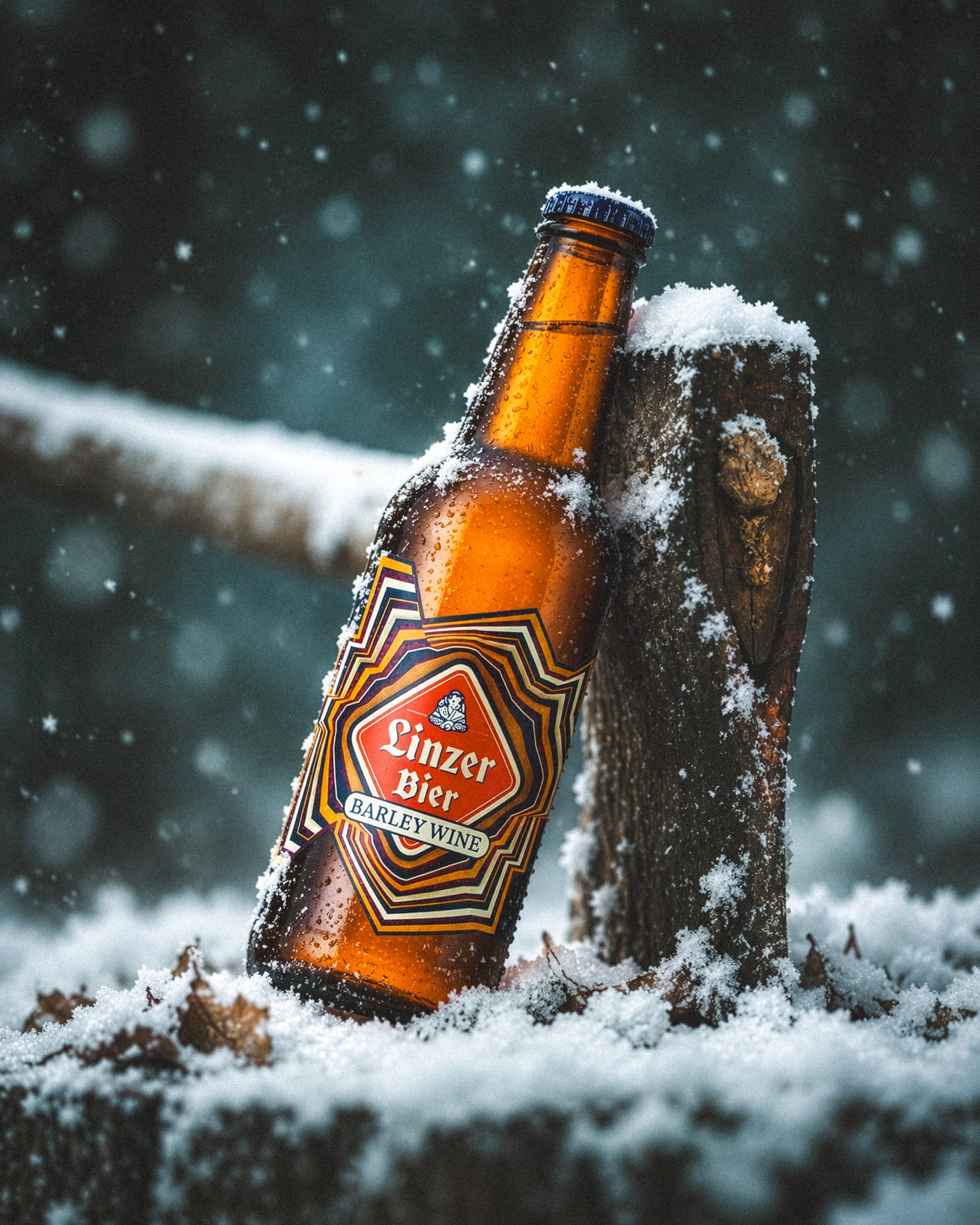
Second place in the competition. Four seasons, four landscapes, four emotions, and one city that inspired them all.
A complete visual identity for a Brazilian coffee house that brings together coffee and music culture.
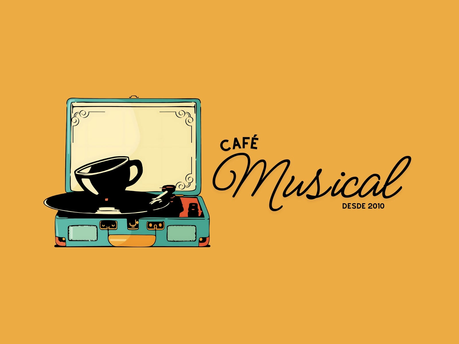
The brand concept connects two worlds: coffee and music. Elements inspired by vinyl records create a visual link between sound and enjoyment, while vintage details combined with a modern, colourful palette reflect the café's warm and creative atmosphere.
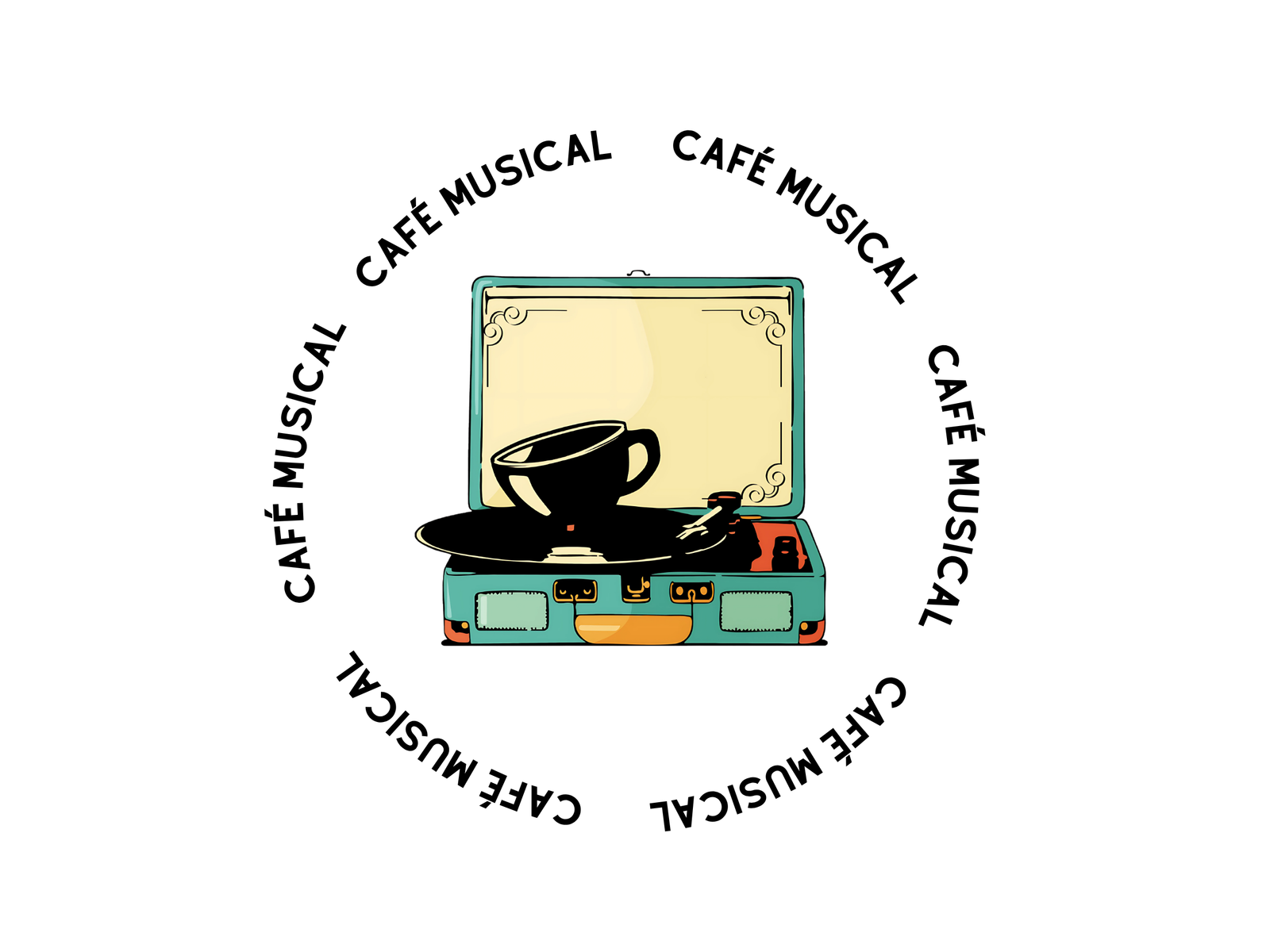
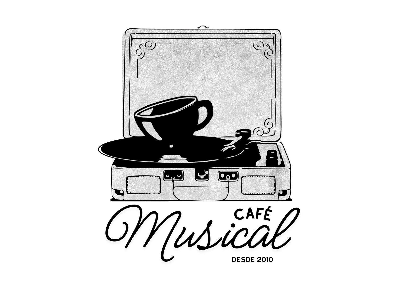
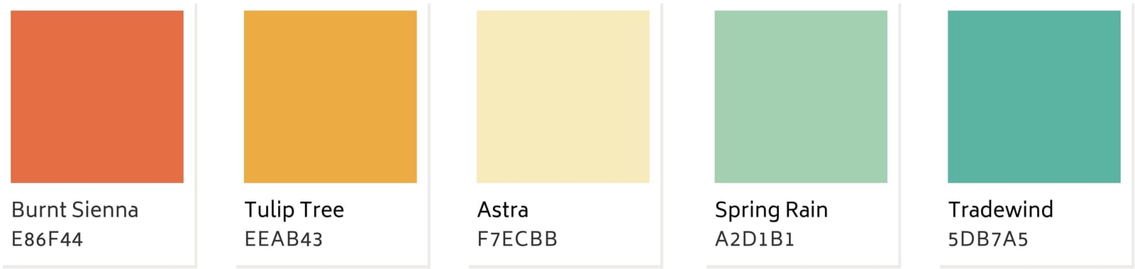
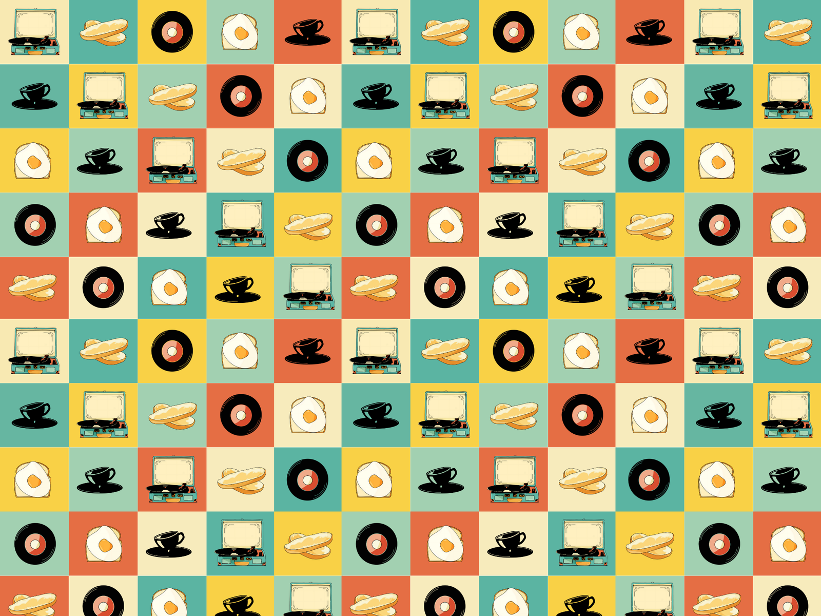
The café first opened inside a music school, which is where its name comes from. When it moved to a new location, it kept both the name and its musical character. In the new space, a large wall covered in vinyl records quickly became the café's signature. I built the new logo around it: a hand-drawn illustration of a record player with a coffee cup sitting on the record. From it, I developed a vertical version, a black-and-white version, a circular submark and a pattern of coffee and music icons. The colour palette is bright and made to catch the eye. I chose the typeface Meow Script because it echoes the café's previous logo: the idea was not to break completely with the old identity, and the lettering kept that connection. Finally, I applied the system to signage, packaging, cups and the menu.
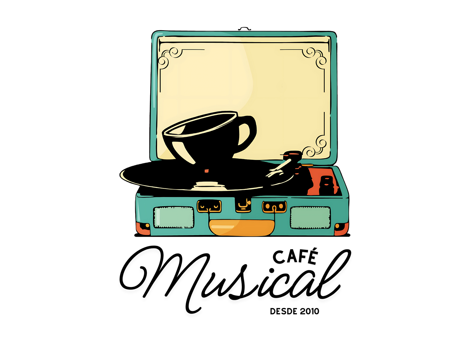
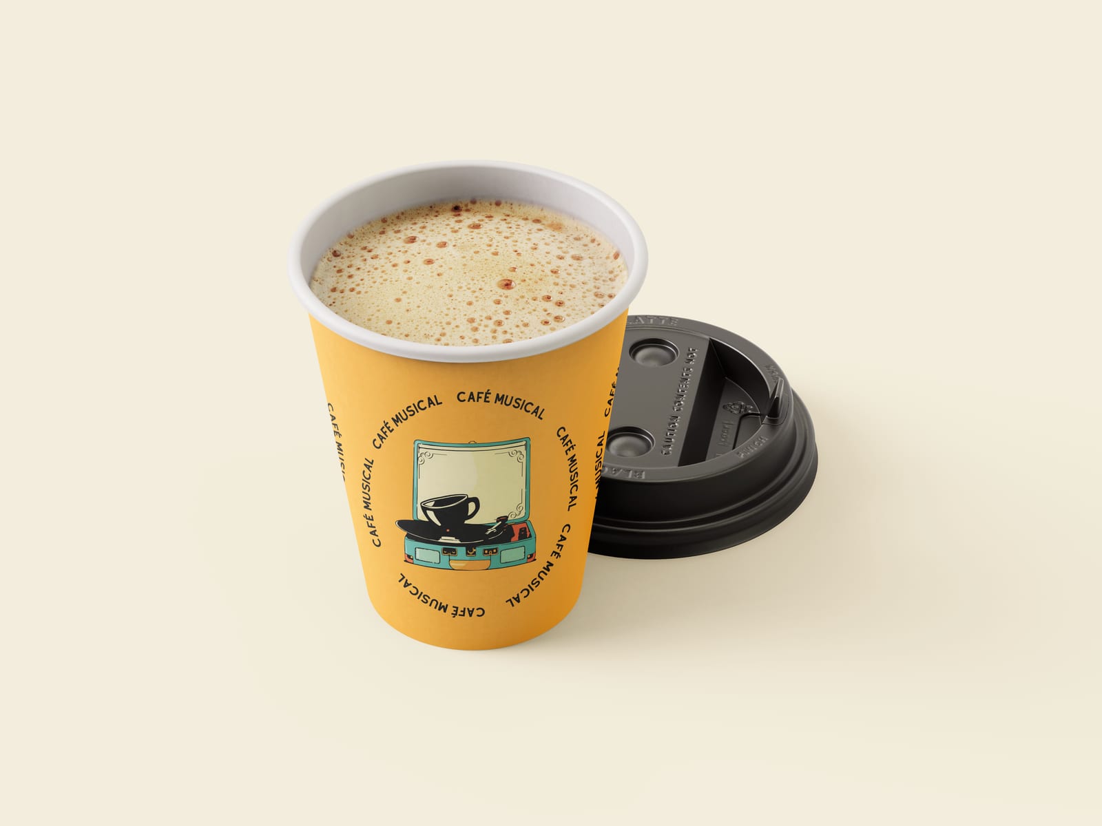
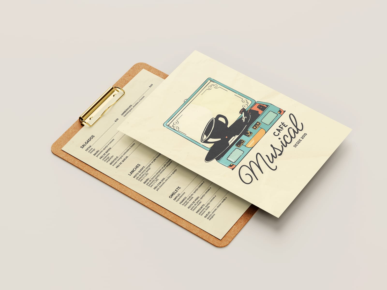
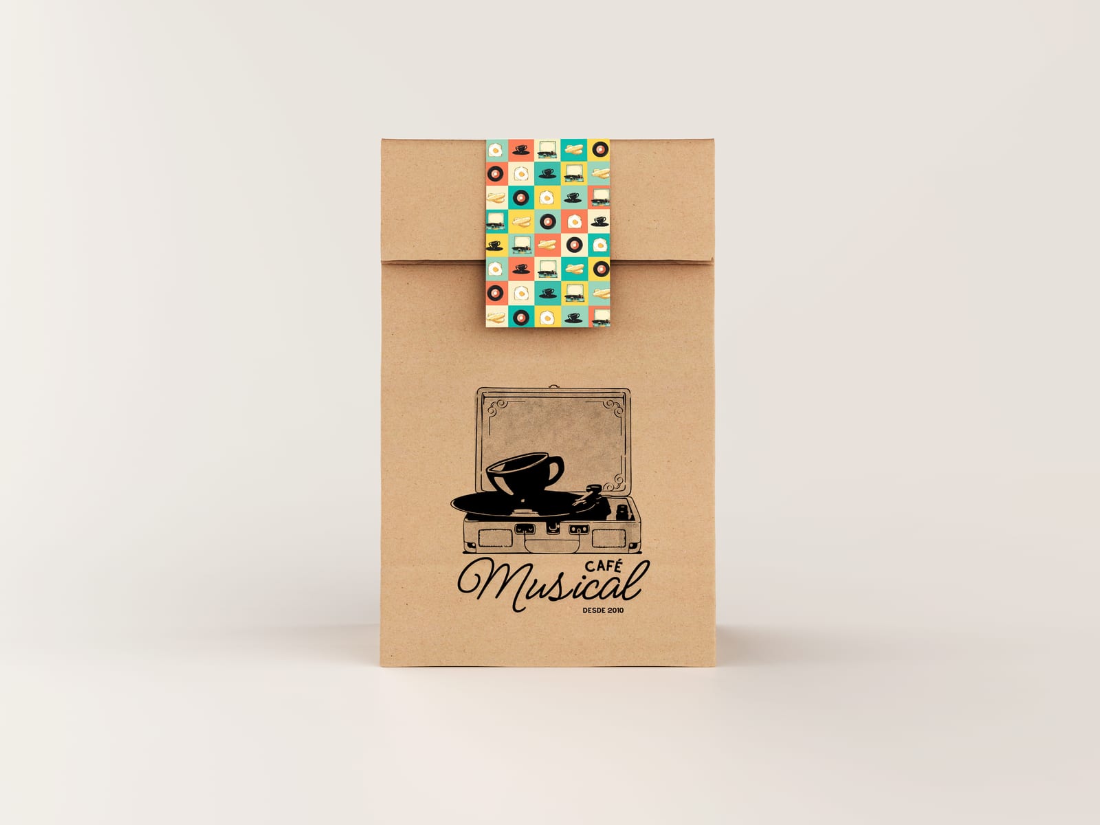
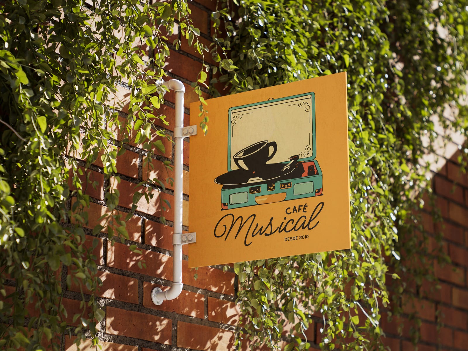
The identity is still in use today and shapes the whole experience of the café, from the sign outside to the cup in your hand.